Assemble
6 weeks
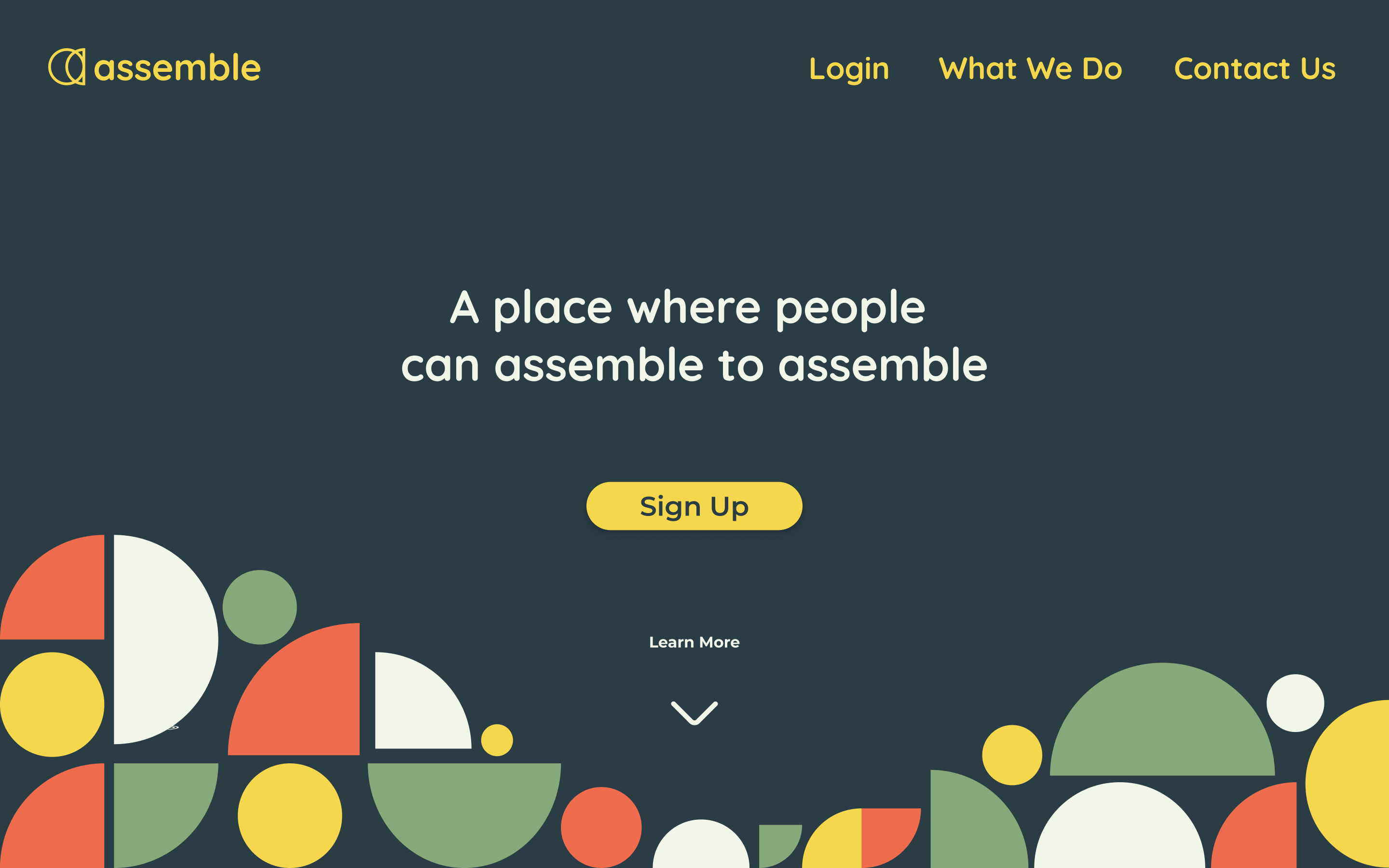
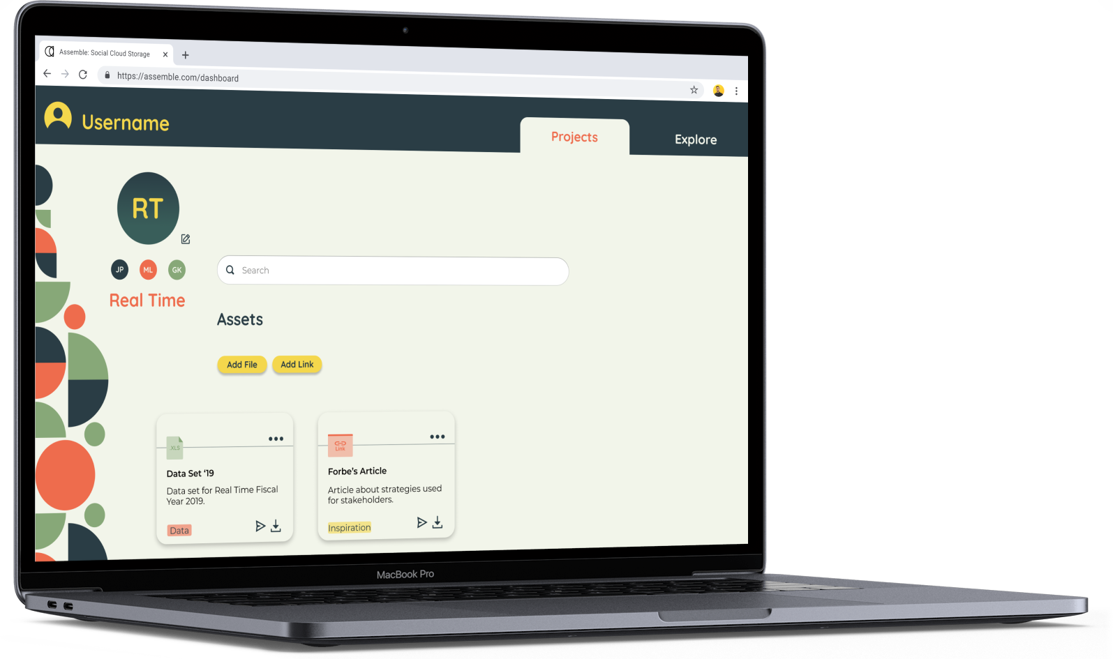
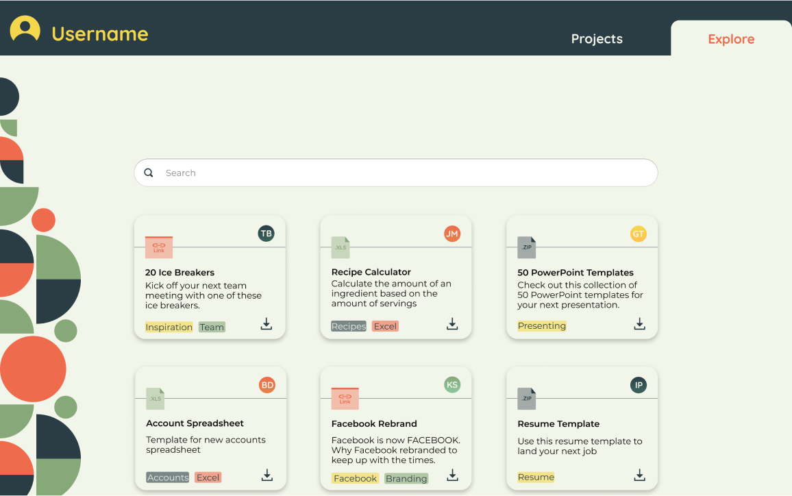
Cloud Storage is a young industry in the grand scheme of technological innovation. Although a vast amount of cloud storage products exist, each very cut and dry. Assemble is an exciting and colorful cloud storage alternative. Users can come together to collaborate on projects or share resources. All while being able to store items.
-
Roles
- UX Research
- UX Design
- Visual Design
- Branding
-
Tools
- Figma
- InVision
- G-Suite
- Usability Hub
- Draw.io
-
Delivered
- User Surveys
- Personas
- Wireframes
- Lo-Fi Prototype
- Brand Guidelines
- Hi-fi Prototype
- User Testing
- Visual Design
The Problem
Cloud storage can be pretty bland and complicated. Simple procedures take too many steps to complete. White backgrounds leave the user longing for more. All in all, cloud storage products tend to be a digital storage unit that no one likes to visit.
The Solution
Assemble is an exciting platform that allows users to store digital assets and links. Users also have the ability to share items either with all users, or to specific users within a project. Every process put into the product is as simple as possible. This makes Assemble an efficient and beautiful tool that keeps users engaged.
Discovery and Research
User Survey
The client brief I received was vague. Full of big ambitions and no defined goals. My first plan of action was to test the assumptions made in the brief to see if they held true.
-
Assumption 1
There’s room for a new competitor in cloud storage.
-
Assumption 2
Collaboration and sharing are functions users want.
-
Assumption 3
Sharing items with friends and family will result in people joining.
Competitive Analysis

Once I posted the survey I did a competitive analysis of three cloud storage services. The services focused most on storage. Collaboration and social capabilities are less emphasized in most services. The analysis showed that there was room for a new competitor. One that focused more on the social nature of cloud storage.
User Survey Results
-
Most users are in an office position and use cloud storage for office-related documents.
95.8% of these users also use cloud storage for their personal life as well.
-
Respondents believe that social websites are good for the workplace.
They use them for things like communication, networking, collaboration, and inspiration.
-
When they use collaboration tools they use them for organization and storage.
Not so much for real-time editing.
-
Users like to share items.
Sharing professional resources with their friends and colleagues is an exciting prospect.
-
Users fall between the age of 18 - 52.
While they vary in position, they all either work in a team or have to share items with other people.
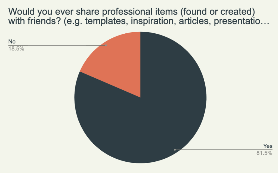
From the data collected, it was clear that there was a desire for more simple collaboration. Respondents liked the idea of merging cloud storage and a social platform. As long as it was efficient, people responded well to the prospect of a product that married the two.
User Personas
The data collected gave me insight into three user profiles. Motivations came from a mixture of the data provided and empathetic assumptions.
-
1.) Team Leaders who communicate and organize.
Team leaders need to be able to oversee the projects they lead. Critiquing work and keeping open communication with team members is most important. They will need to do this in an organized manner when working on many projects.
-
2.) Team members who collaborate and share.
Team members need to be able to collaborate with their teams. Uploading files, and having a file version function would be most important to their work. Making these functions simple will boost their efficiency while contributing to their team.
-
3.) Individuals who store and receive.
Individuals, such as freelancers, will need to be able to store and receive. Storing assets and receiving feedback (or inspiration) is the main motivation. Having the ability to showcase their work would be important for the work they do.
These profiles were the inspiration for the user personas. Each profile brought to life by assigning a face, characteristics, and brands to them.
-

Stephanie P.
Office Manager
Goals
View Progress and leave feedback on projects that she leads, manages, or advises for.
Frustrations
Inefficient procedures and miscommunication between team members.
-

Daniel J.
Student
Goals
Share, receive, and download items between peers that he collaborates with.
Frustrations
Unorganized systems that make projects complicated and files that are out of date.
-

Michael C.
Freelancer
Goals
Storing items and being able to showcase them so he can receive feedback on them.
Frustrations
Getting stuck in a creative rut. Confusing procedures that he has to figure out.
Information Architecture
User Stories
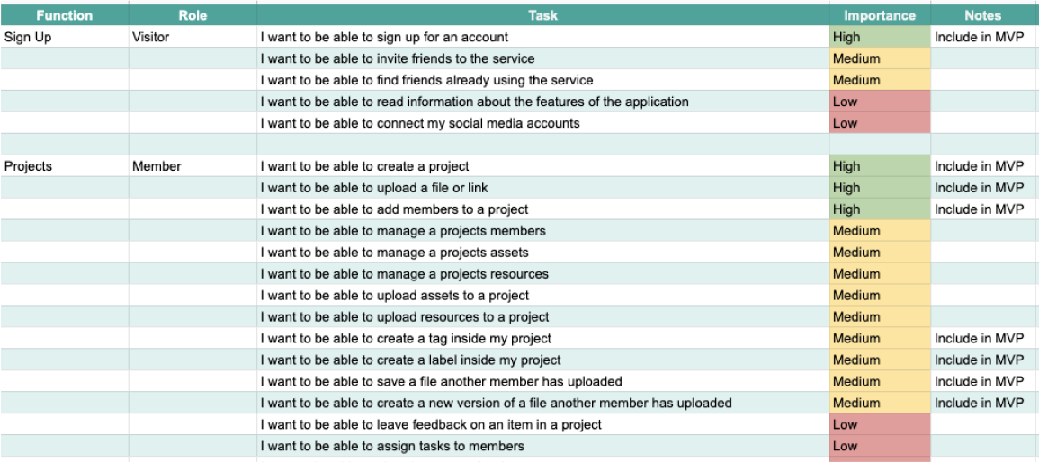
I split the procedures needed in the application into four main categories:
Sign Up
Explore
Organize
Collaborate
I broke down the categories into steps prioritized by their importance. Features were judged by whether or not they would help the product stay competitive. This was gauged by going back to survey data, and customer reviews of competitors.
User Flows
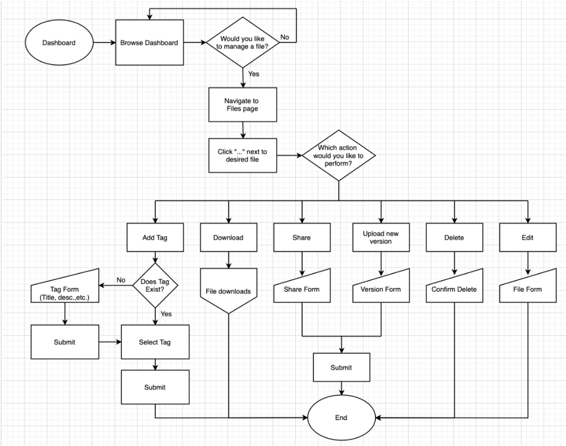
Tasks included in the MVP became mapped out in a flow chart. A major change happened here. The redundancy of having both labels and tags came to attention. The original intent was to have tags sorted under labels. I realized that this would be a barrier to users and a potential for confusion. Coming back to the idea of simplicity reinforced the importance of this decision. In turn, this instilled in me the importance of going back to your foundations. Especially while sorting out the details.
With user stories backed by research in place, and mapped out through user flows. It was time to put pencil to paper and figure out the organization of the page content.
Wireframes
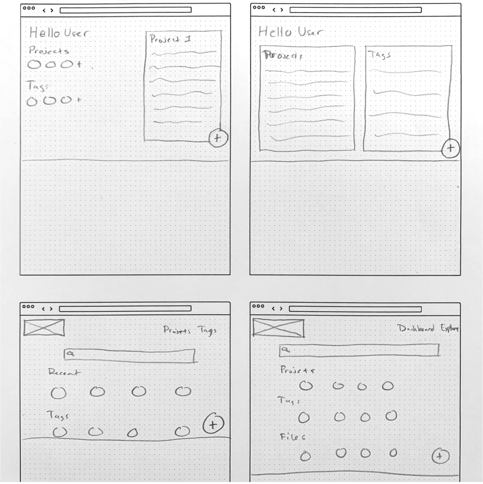
In the first round of design, I decided to have a search bar on the screen. This would ensure that you'd always be able to navigate to what you were looking for with ease. Items and Projects sorted in a grid to keep things organized and skimmable. I thought of using an overflow grid (like Pinterest). The organized chaos of an overflow grid made skimming difficult. This didn't line up with the goal of simplicity. The decision to stick with a basic uniform grid was better aligned with the goal of the product.
While I considered a few different layouts, most of them proved to be more complicated. This landed in the decision of using a more familiar design. The search bar front and center with the content underneath. Allowing users to know what was on the page as soon as they look at it.
User Testing
While successful, there were some major insights gathered from the results:
-
There was no need to add anything but projects from the dashboard.
-
The size of the add button was disliked by all participants.
-
There was no way to tell which item was a file or a link.
-
Participants appreciated the simplicity of the design.
These insights brought about some major design changes. All in which emphasized simplicity and efficiency.
I performed user testing online and in-person with a diverse group of participants. I tested the fundamental operations of the product. These include adding projects, navigating to different pages, and managing files. Participants were able to complete the tasks. On average it took the users roughly 10-15 minutes to figure out what the application was.
Visual Design
Branding

The product focuses on collaboration. While doing research, I came across the word "assemble". This fit because the product I'm creating was all about assembling projects. On top of that, the product has a social nature, it's a place for people to assemble. The word was a natural fit for the name as it encompassed every aspect of the application in a single word. It's a place where people can assemble to assemble.
With the name picked, I assigned three characteristics to communicate through branding:
Energetic
Cordial
Friendly
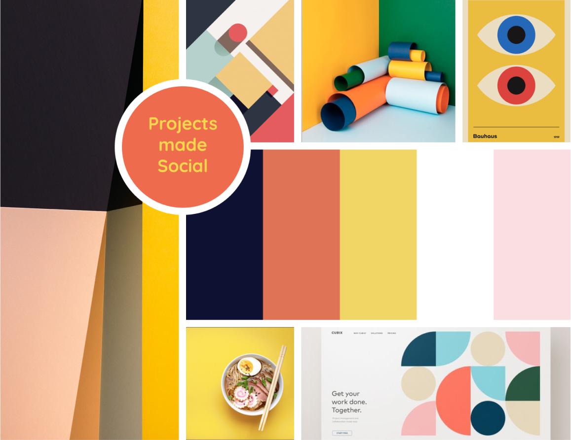
Energetic to help communicate efficiency. Friendly to communicate the social nature of the product. Cordial to help find the balance of a social yet professional platform. With these characteristics in place, I put together a mood board to help define the aesthetic.
Branding: Logo
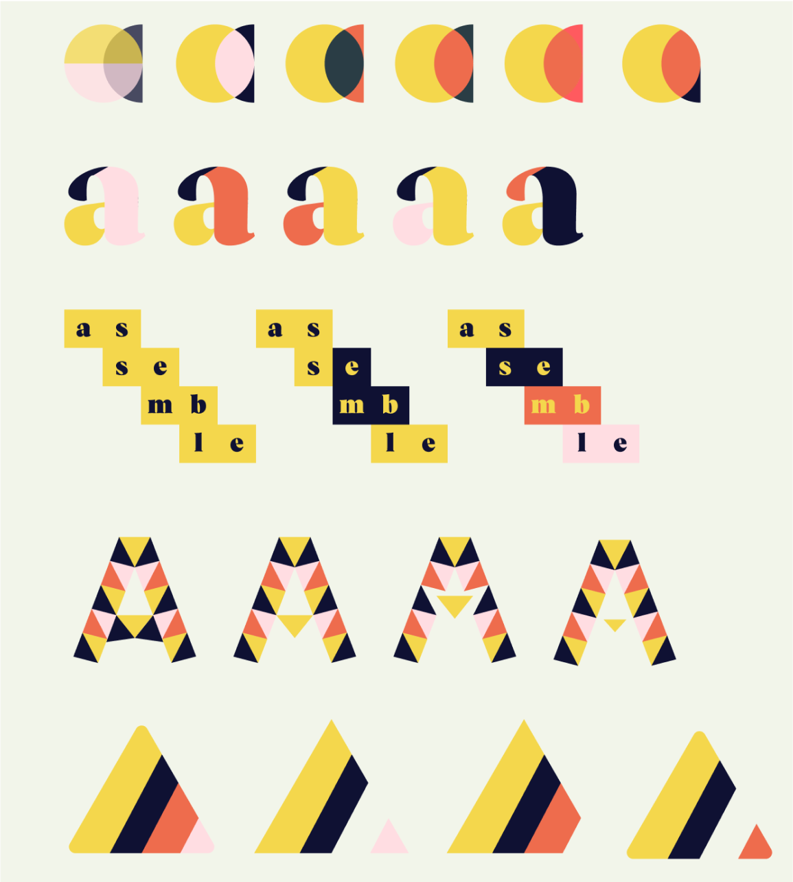
With "Assemble" being the name of the product, I created logos that took many pieces to create one logo.
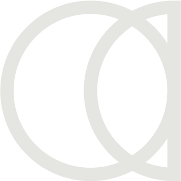
After many drafts, I chose this logo because of its simplicity. It's able to convey the message of the brand. It brought pieces together to make a single item, it was simple, it was effective, and it looked like the letter "a".
Now I needed a typeface to go with this logo. Something with character but easy to read.
Branding: Typography
When it came to typography, there were two font pairings that I went back and forth on.

Ubuntu and Muli
I appreciated the sharpness that Ubuntu provided in a font that was also more rounded. It's rare that you find a good medium of the two. This accompanied the logo well as it had sharp corners but was round in nature. Muli was a nice pairing because it has a similar structure to Ubuntu. It's nice and legible and had a variety of weights to choose from.

Quicksand and Montserrat
Quicksand was a great candidate because of its roundness. When I first saw the type I immediately thought friendly and cordial. It also helped that it had an identical structure for the lowercase "a" as I used for the logo. Montserrat was a nice pairing because it's renowned for its weight variety. The structure of it was similar as well.
Ultimately, I chose Quicksand as the typeface because the characteristics I defined earlier were strongly expressed. While both were good contenders, Quicksand and Montserrat did the job the best.
Branding: Color
Starting Pallete
Final Pallete
Yellow was chosen as the main color for the brand. Yellow carried themes of productivity that were important to communicate. A product focused on project collaboration needs to convey efficiency and movement. Yellow was the perfect color for this.
The color pallete was changed from what was originally on the mood board. There was a concern for accesibility on some of the combinations. A more matte blue was chosen, along with a an orange and green that would be easier on the eyes.
Branding: Guidelines
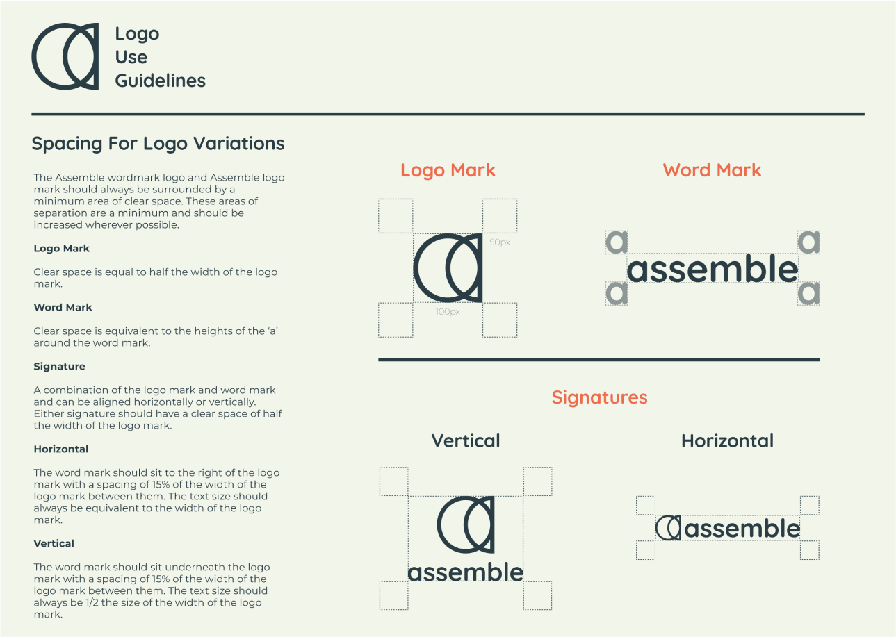
Guidelines were created to make sure the brand remains consistent across the board. The guide covered topics ranging from logo use to typography practices. It also includes button styles and acceptable color combinations.
With the brand guidelines in place, I created the first round of hi-fidelity mock-ups.
Mock-Ups
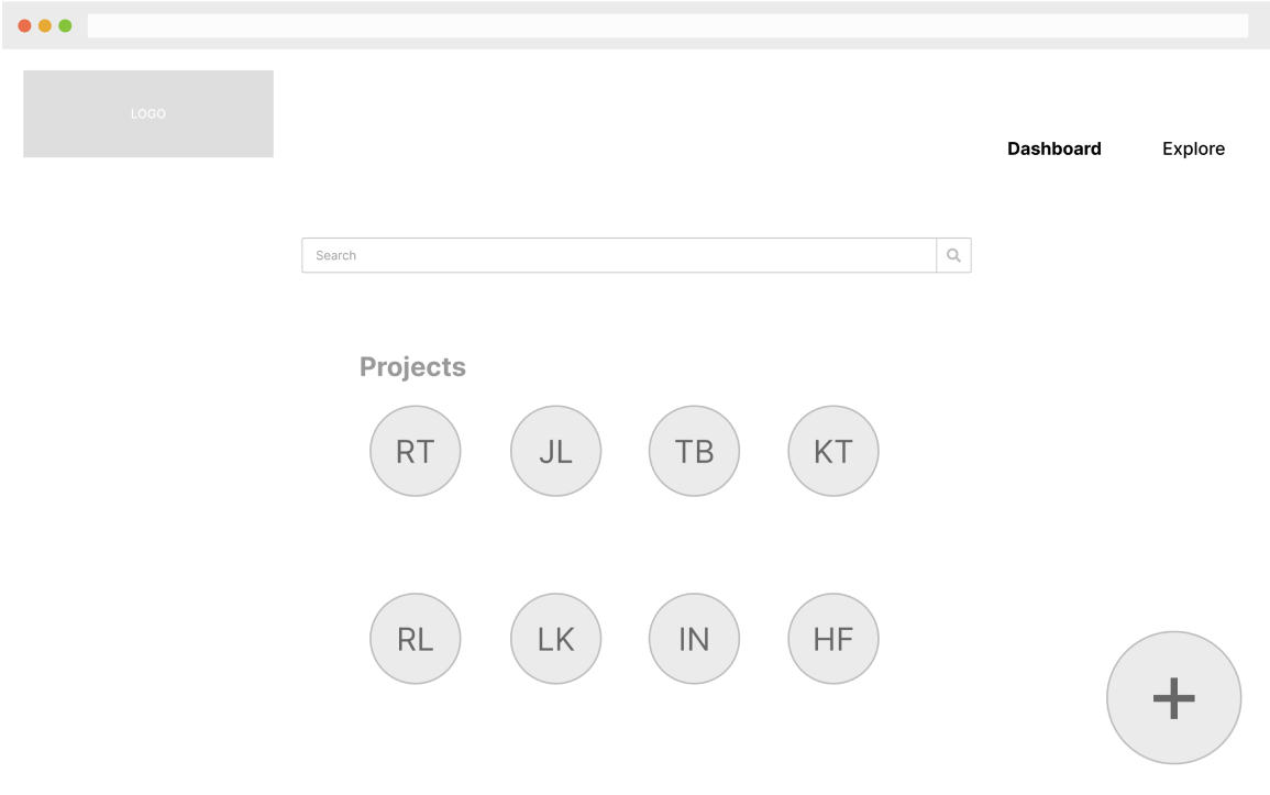
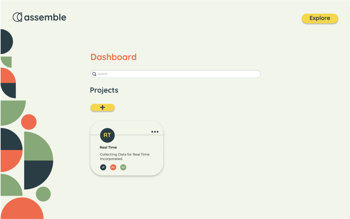
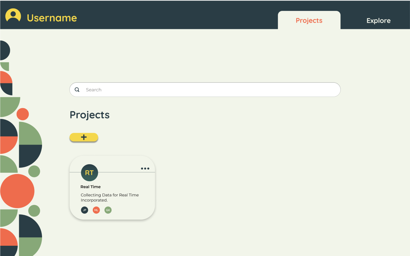
On the dashboard, I decreased the size of the add button. Instead of relying on size to make it stand out, I used color. The format of the project list was also changed to be more consistent with the items. This helps maintain consistency as well as provide more information in one area for the user.
Mock-Ups: Dashboard
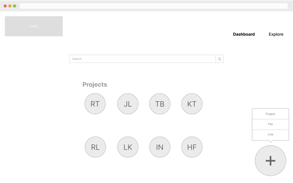
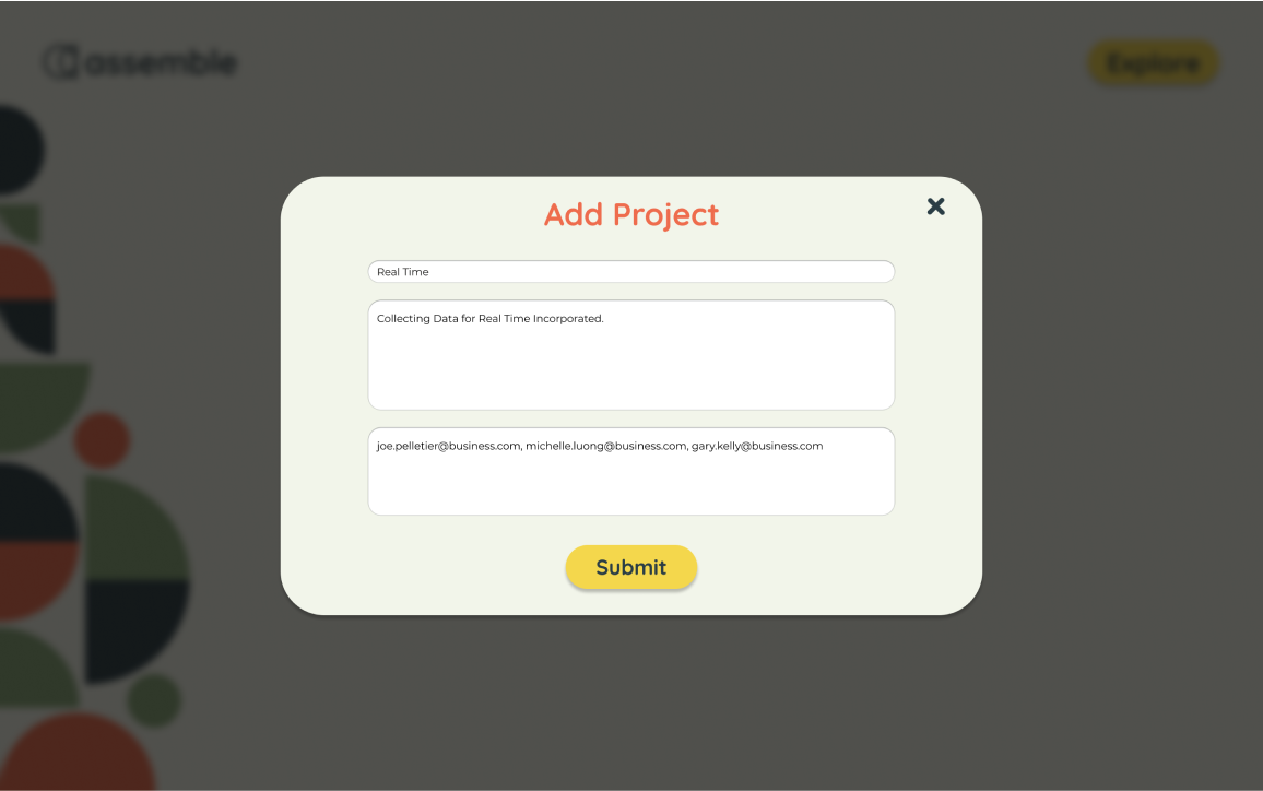
I removed the ability to add a file or link from the dashboard. It was never utilized within user testing when asking users to upload items. Instead, there is a single “add” button that displays the “add project pop” up when clicked.
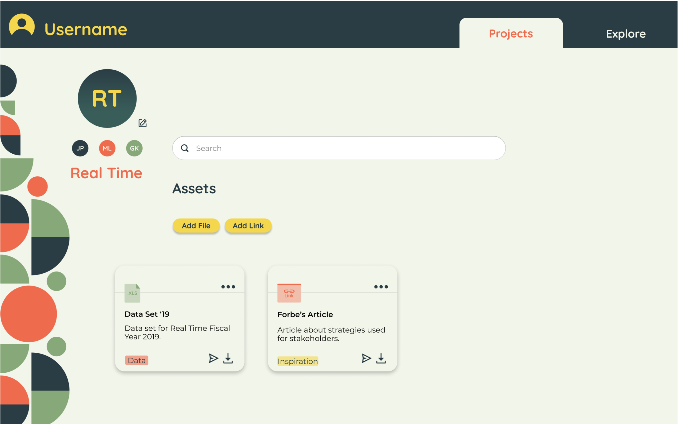
Mock-Ups: Project Page
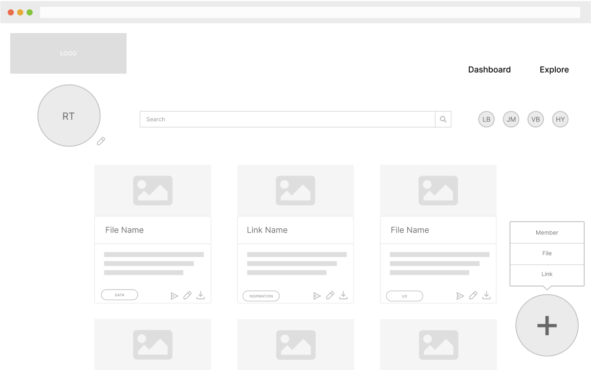
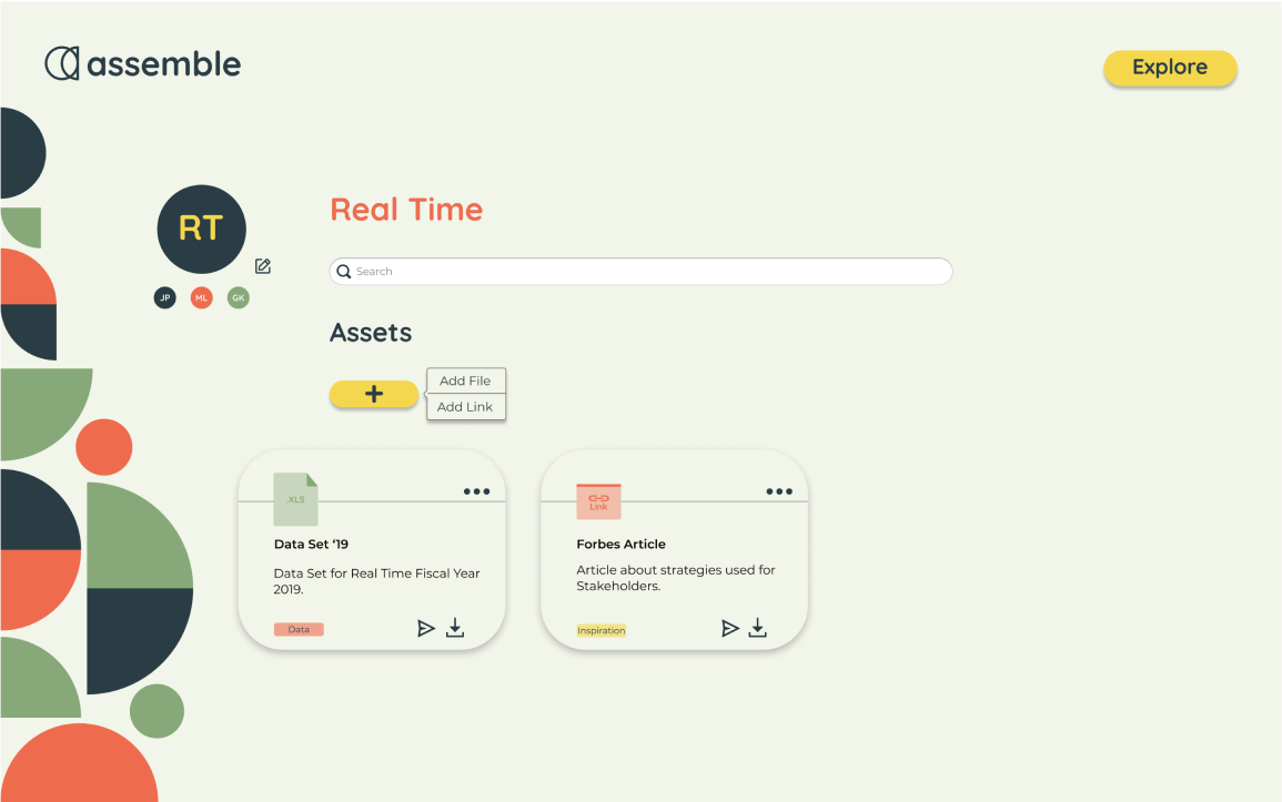
While the button changes were made, I also made minor layout changes to help with information organization. I replaced the view of the file/link with an emblem to help boost uniformity. This helped make it easier to scan and boosted efficiency.
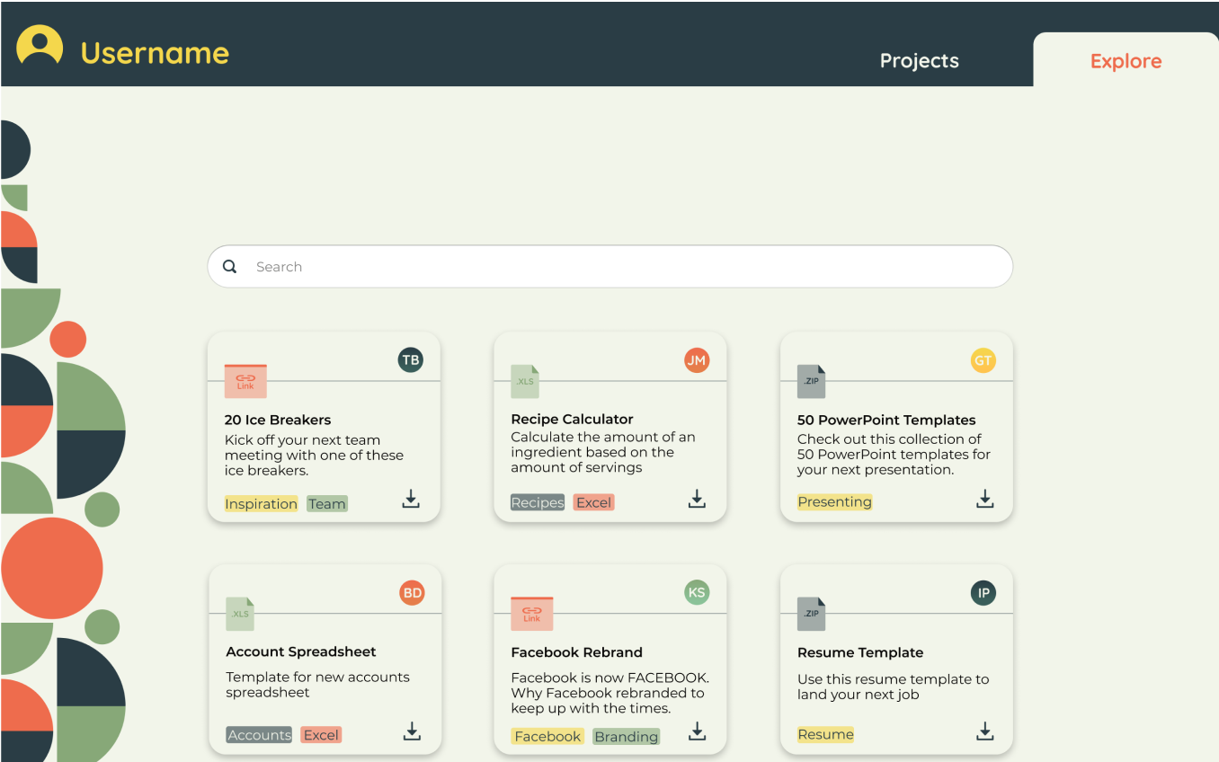
Mock-Ups: Explore Page
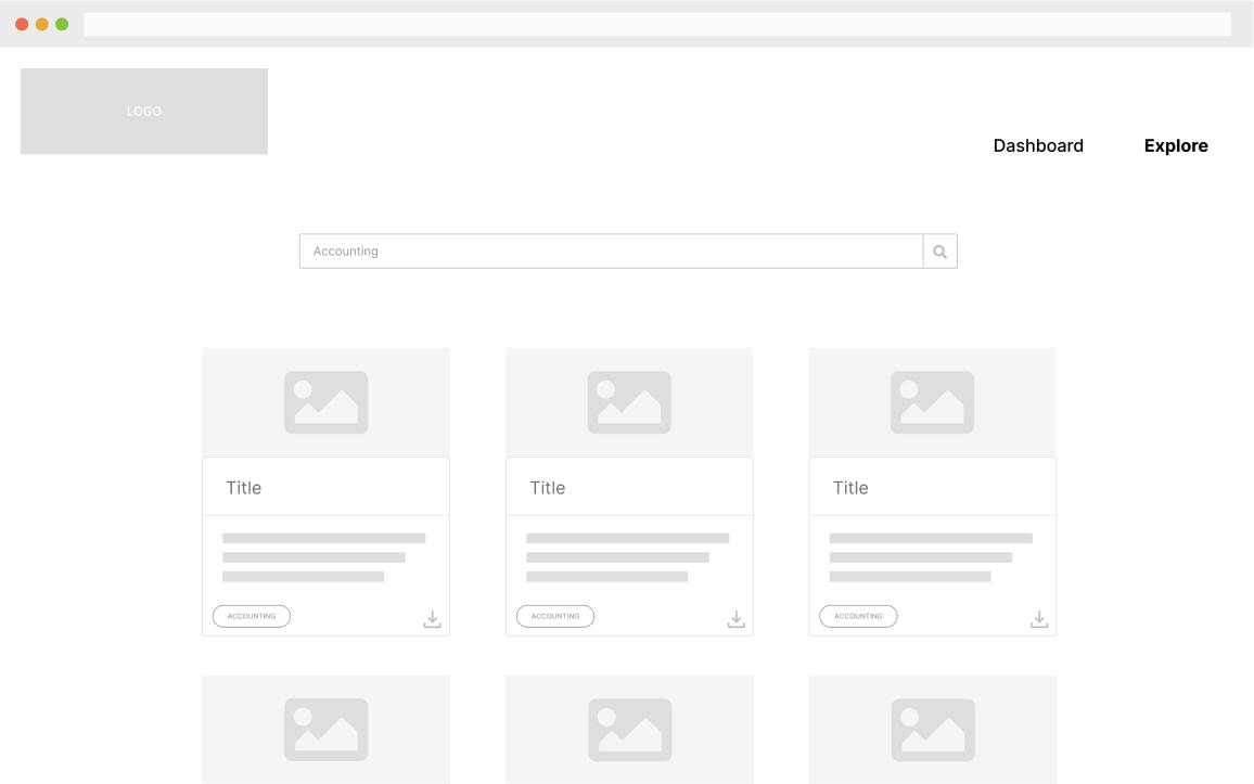
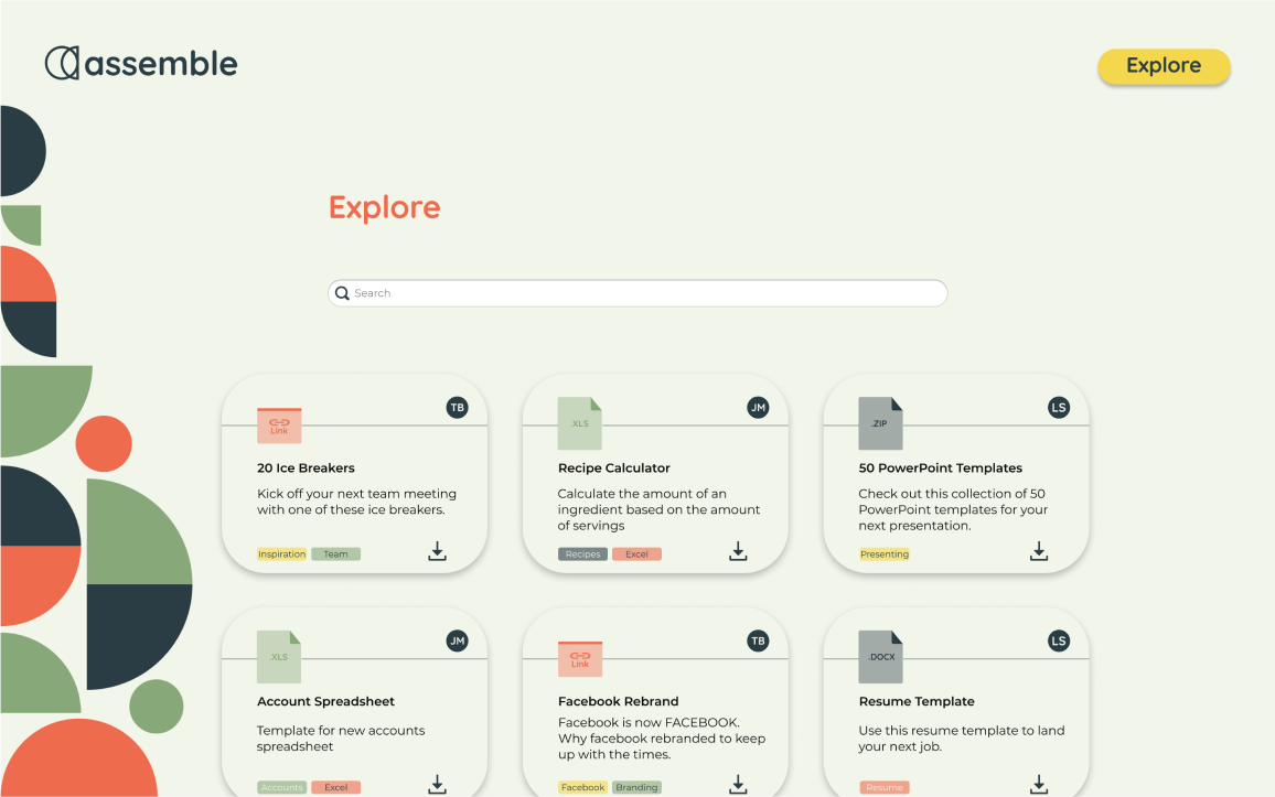
On the explore page, I added an emblem that represented the user that added the item. This was a feature that users expressed a desire for. It also helps reinforce the social nature of the product.
Preference Testing
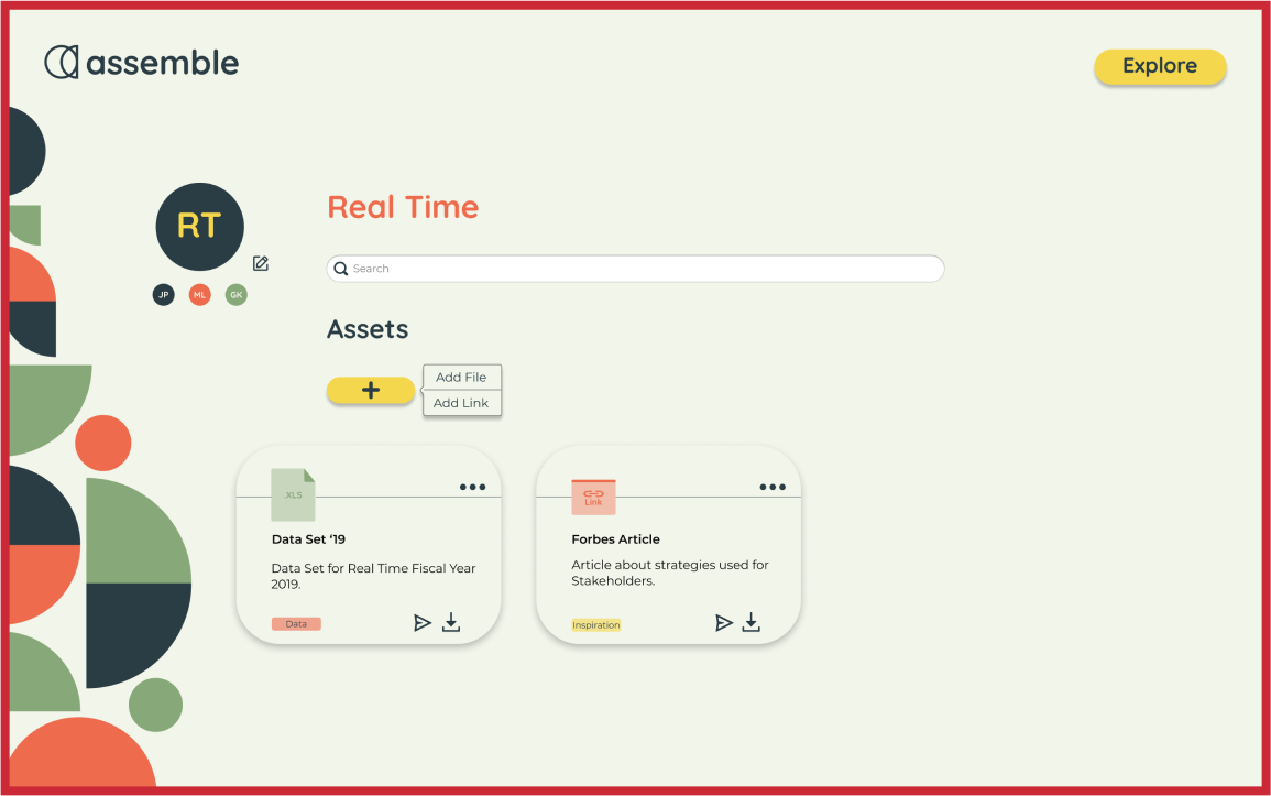
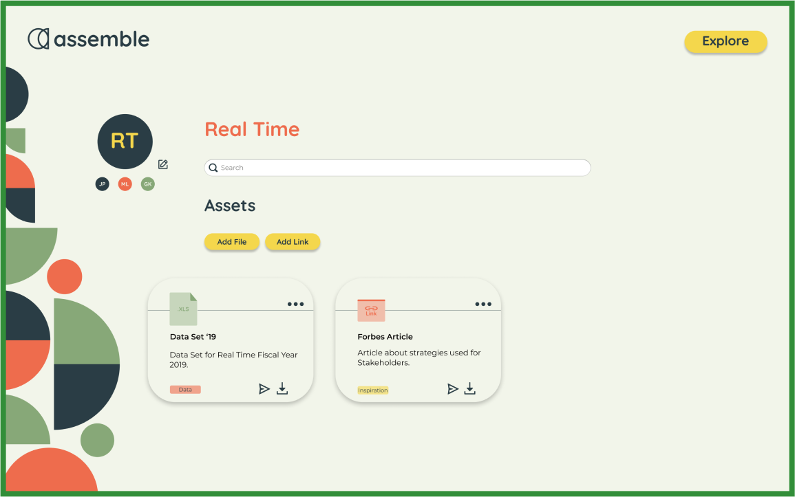
I found that users liked having the option of two different buttons to click a single time. One button that revealed a pop-up menu with a sub button to click wasn't simple. This also lined up with the value of efficiency decided at the beginning of the process.
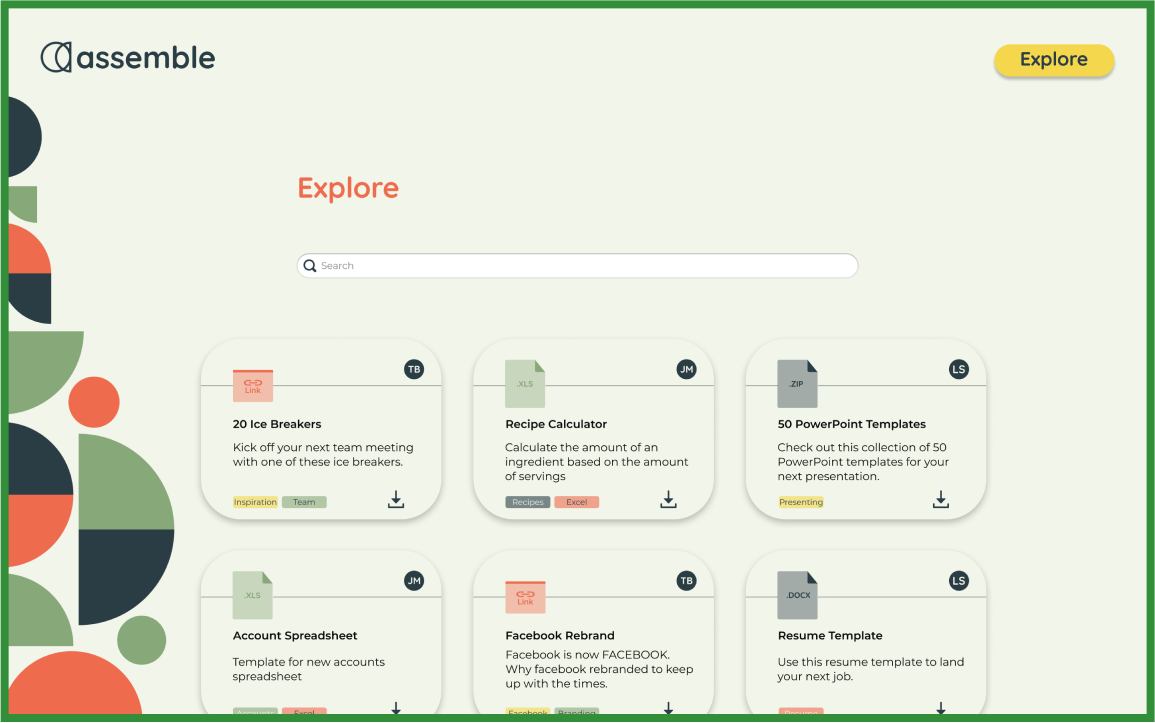
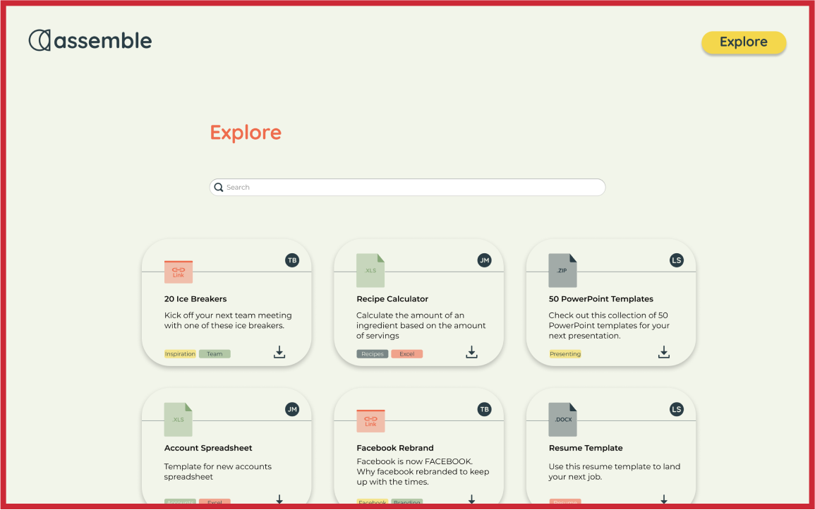
One surprising consensus was keeping the side element on the page. While I thought it busied the page, users voted to keep it. I did drastically change the size later in the process.
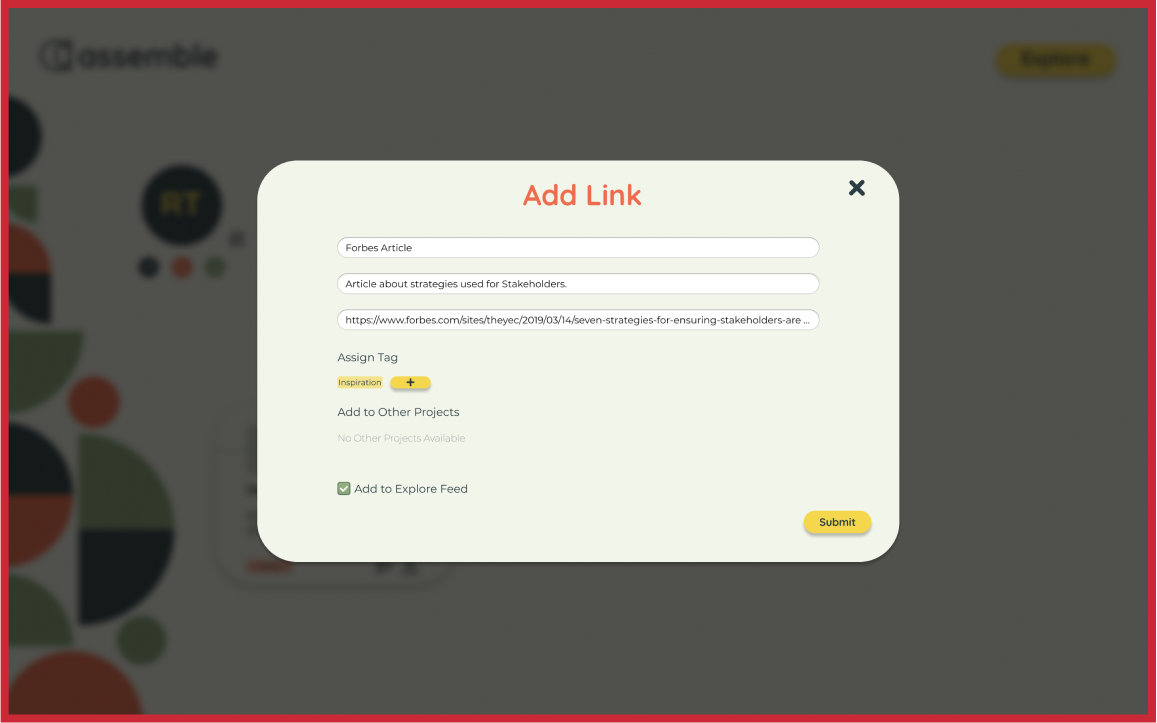
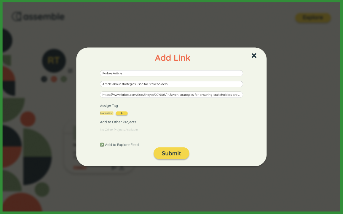
The final reinforced decision was to keep the submit button to centered and large. Instead of smaller and off to the right corner, again, making actions as simple as possible.
Finishing Touches
With designs in place, there were some more adjustments to make before delivery.
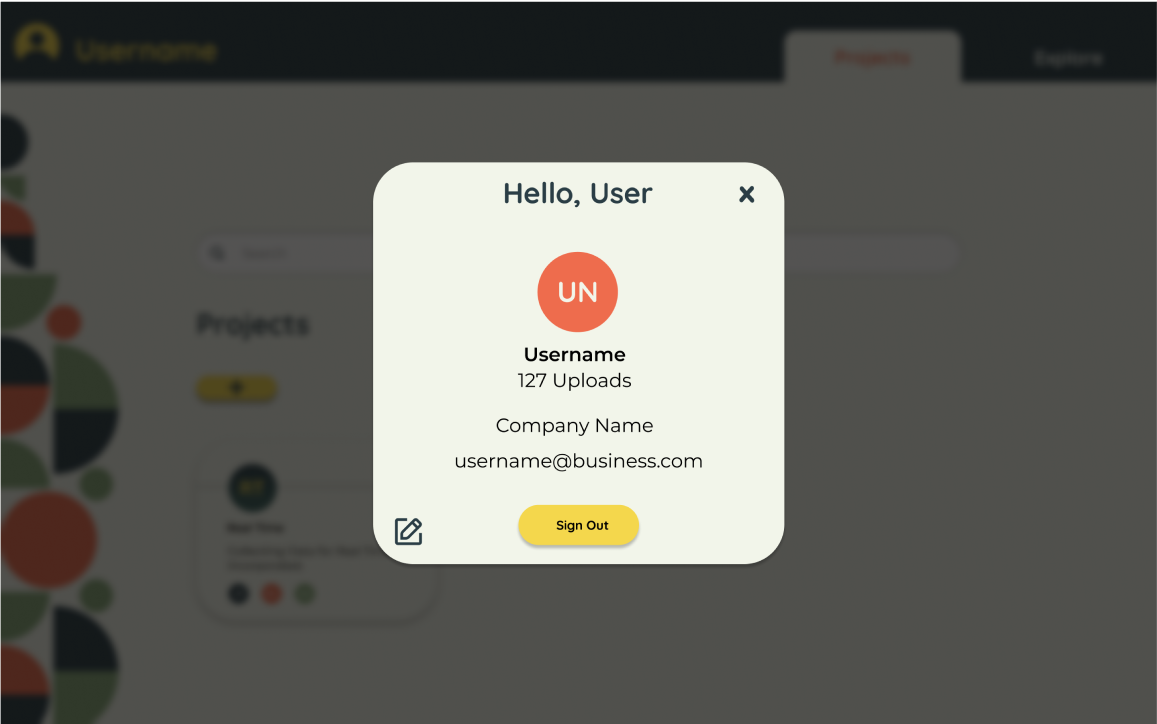
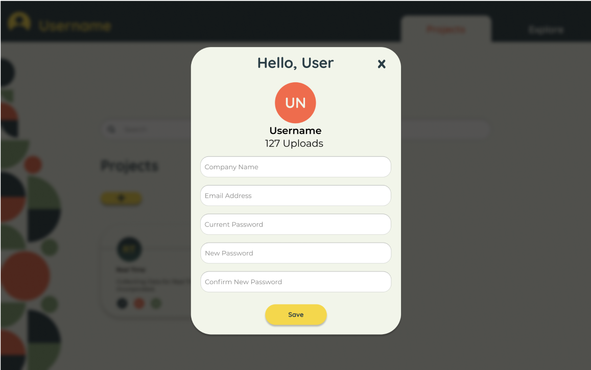
A function to edit your profile was missing and requested in tests. The plan was to leave it out of the MVP. After returning to the idea of the social nature I decided that it was necessary to include. I added a slimmed version of profile editing that could develop more later down the road.
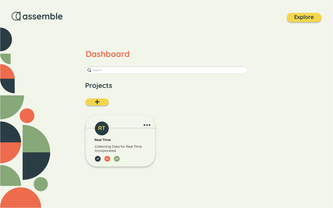
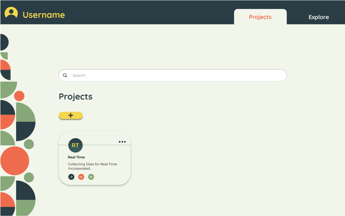
The next major edit being the navigation bar. I changed the logo to be a user icon as an entry point for users to make adjustments to their profile.The next big change was switching the name of the dashboard to "projects". I did this to help clear confusion between the dashboard and the specific projects page. The final change was changing the page indicators to be nicer to look at. The change also helped to clarify where you are within the application.
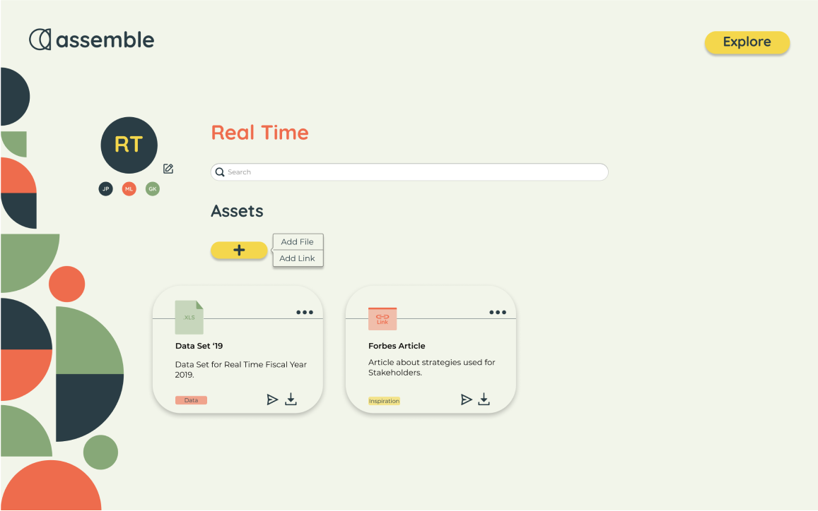
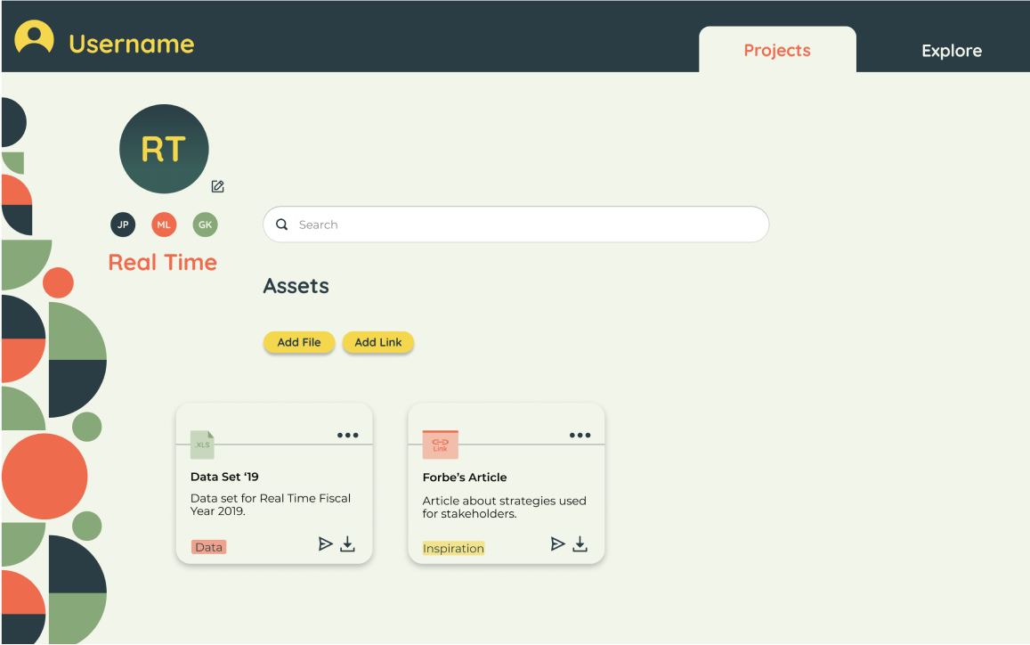
The project page received a realignment and organizing of the project information. This allowed the user to read and digest it easier. The two separate buttons that came from preference testing appeared as well.
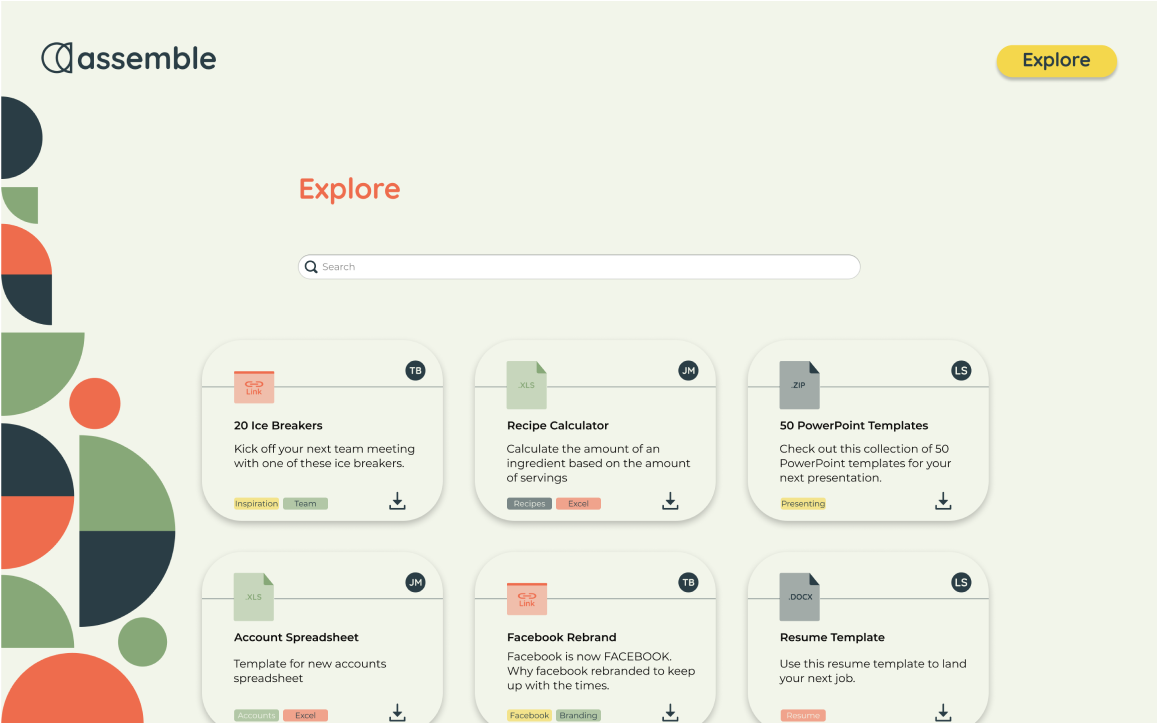

The explore page received changes in the item cards once again. I carried these changes to every page to remain consistent. I decreased the rounded corners to help with the alignment of icons and emblems. I didn't make any other major changes outside of that. The page performed well in every test and proved to be effective and efficient.
Final Thoughts

This project came with a lot of lessons, both technical and theoretical. The main theme I found myself coming back to was the importance of laying a solid foundation to work on. Making decisions and sticking to them makes for smoother work down the road. The secondary theme for me in this project was the value of user testing. Many times throughout the process, I would make a decision based on trendy design. Each time I did this, users didn't respond well to the design. It was a solid reminder on the importance of being a user-focused designer. It would be a shame to make beautiful designs that no one liked to use.
