
Kurry
4 weeks
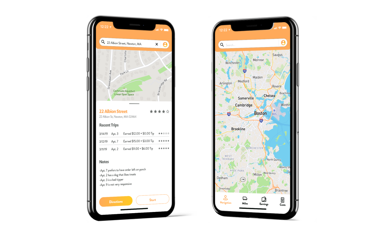
The Gig-Economy has been booming ever since 2009 when Uber made its debut to the world. Since then we’ve seen major growth in ways that people can make money by utilizing their vehicles. While there are plenty of driver assistance apps out there, all of them are geared towards rideshare drivers. Kurry is a mobile application that that serves as a navigation and tracking tool for drivers who deliver things as opposed to people.
-
Roles
- UX Research
- UX Design
- Visual Design
- Branding
-
Tools
- Figma
- InVision
- G-Suite
- Usability Hub
- Draw.io
- Maze
-
Delivered
- User Surveys
- Personas
- Wireframes
- Lo-Fi Prototype
- Brand Guidelines
- Hi-fi Prototype
- User Testing
- Visual Design
The Problem
While studying UX I delivered groceries on the side. In my time driving I realized there was a serious hole in driver assistance apps for people who don’t transport people. Seeing this hole inspired me to put my newly acquired skills to work and create an application that could serve drivers who carried things to people rather than people to destinations.
The Solution
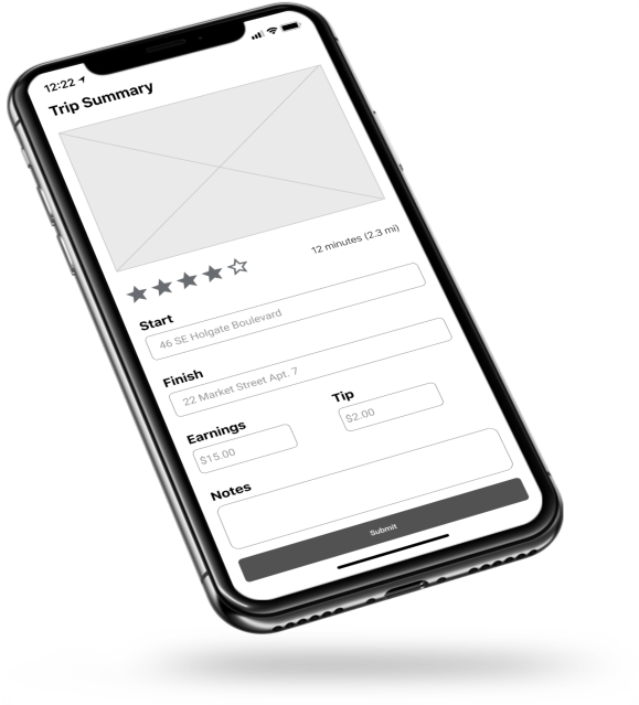
Kurry is a driver assistance application that meets the needs of Courier and delivery drivers.Ultimately, Kurry helps drivers maximize their earning potential. With navigation inside of the app, drivers are able to track mileage automatically without having to be tracked through location services 24/7. The summary at the end of each trip allows them to put in their earnings and any tips made, alongside any notes so that they can better track which destinations come with different types of problems or advantages. These features allow drivers to see what they’re really making while keeping their business organized to maximize their earnings.
Discovery and Research
User Survey
I started my research by looking at different reddit threads and facebook groups to see how other courier/delivery drivers were managing with their business. I noticed a few common themes throughout the posts that helped to build assumptions to test.
-
Assumption 1
Drivers are taking more than one delivery on a single trip and need help managing them.
-
Assumption 2
The ability to take notes on customers is important for Courier/Delivery Drivers.
-
Assumption 3
Drivers need help managing their business.
Competitive Analysis



Based on the analysis of three competitors: Gridwise, SherpaShare and FarePilot, I found that driver assistant apps are all the same. Focused on drivers that deliver people. Most of the functions found within these apps are now present within the “gig app” that they’re supposed to assist with. Being able to take notes, as well as track mileage and earnings would make Kurry stand out.
User Survey Results
-
Drivers are widely ranged in age, and come from a diverse set of circumstances.
The age range for a driver was anywhere from 18 - 62, and covered the full range of level of education.
-
Drivers were taking multiple deliveries, but didn't have trouble managing them.
65.9% of respondents believe that taking multiple deliveries is the best way to maximize their earnings.
-
Drivers are already taking notes and referring back to them.
83% of drivers said they take notes on customers so they could keep track on which ones were good tippers.
-
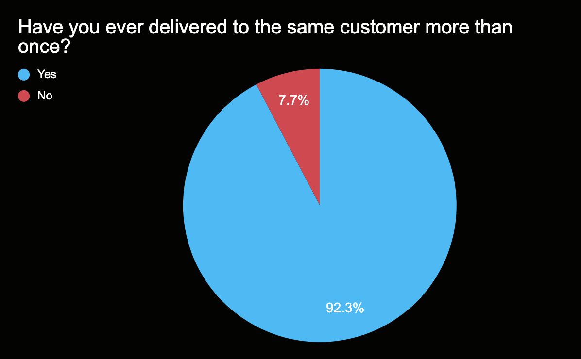
Drivers are delivering to the same customers multiple times.
92.3% of drivers said they've delivered to the same customer more than once. This let me know that being able to note on customers was that much more of an important feature.
-
Drivers want help managing their business.
When asked what their biggest complaint about driving as an independent contractor, 90% of respondents said that managing the back end was too hard.
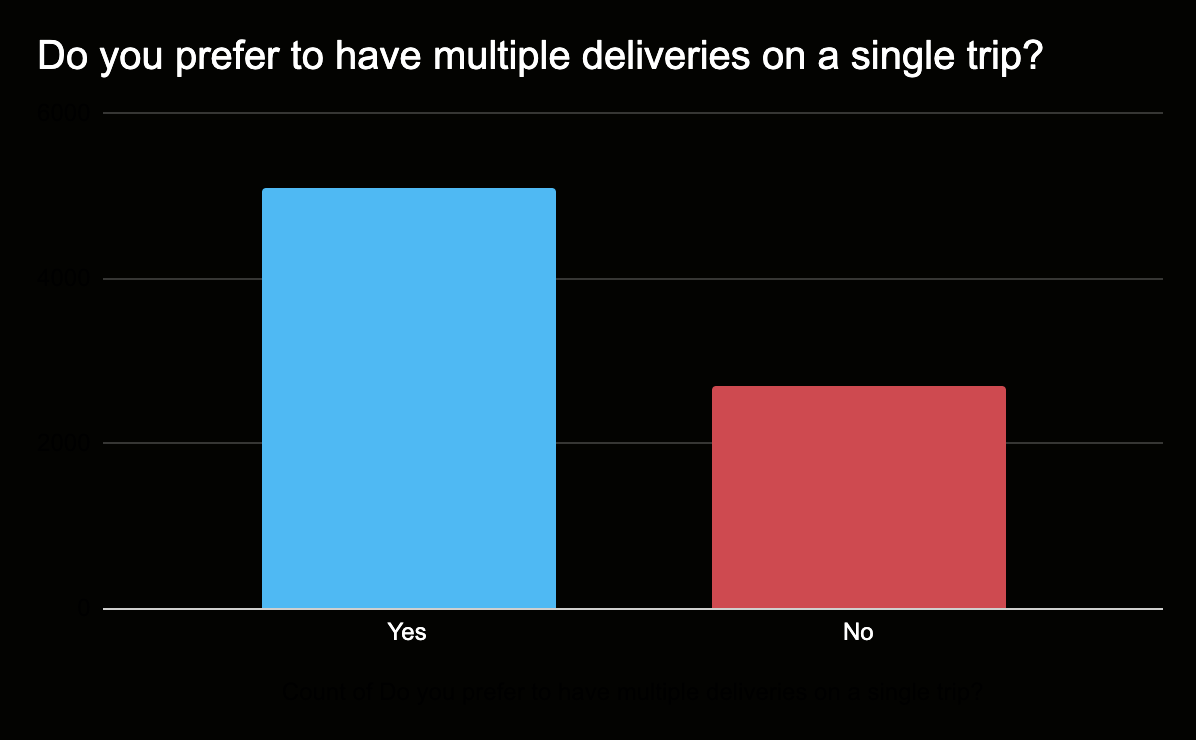
From the data collected, I found that for the most part, my assumptions were correct. Having a product that can be a place for a delivery driver to manage the multiple aspects of their business is something that delivery drivers are looking for. The results told me that the key features should focus more on recording and noting, as opposed to enhancing performance and boosting efficiency.
User Personas
The data collected gave me insight into three user profiles. Motivations came from a mixture of the data provided and empathetic assumptions.
-
1.) 18 - 27 year olds
These drivers are typically current students or recent grads. They like the flexibility that the job offers, and drive on a "when I have time" basis.
-
2.) 28 - 45 years olds
These drivers tend to be parents who use driving to supplement their income. While they enjoy the flexibility it's more in regards to being able to take off whenever they want. They keep a tight schedule for driving during the week.
-
3.) 46 - 60 year olds
These drivers typically don't have any kids at home. They drive to make some extra money, and have something to do during the days. Their main motivation to drive is purely monetary.
These profiles were the inspiration for the user personas. Each profile brought to life by assigning a face, characteristics, and favorite applications.
-

Ashlee C.
24 Years Old
Goals
Have a modern aesthetic that's functional.
Frustrations
Inaccuracy and difficult customers.
-

Tanya J.
36 Years Old
Goals
Plan trips effectively and keep things organized.
Frustrations
Difficult merchants and limited capabilities.
-

George L.
60 Years Old
Goals
A simple platform that helps him see his profitability.
Frustrations
Lack of clarity and unnecessary confustion.
Information Architecture
User Stories
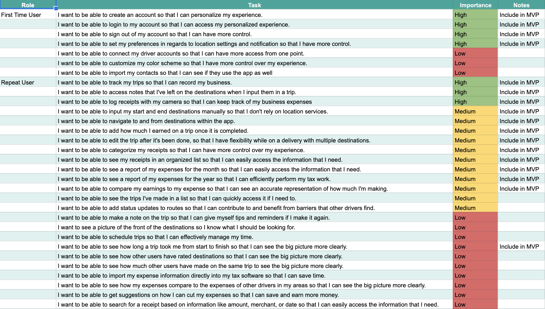
With Personas in place I was able to sit down and flesh out a list of user stories that drivers would want. After creating an exhaustive list, I then prioritized the stories and assigned what would make it to the MVP. There were three tasks that absolutely needed to be on the product:
Track Trips
Take Notes
Upload Receipts
I broke down the steps it would take to complete these tasks and prioritized by their importance. Features were judged by whether or not they would help the product stay competitive. This was gauged by going back to survey data, and customer reviews of competitors.
User Flows
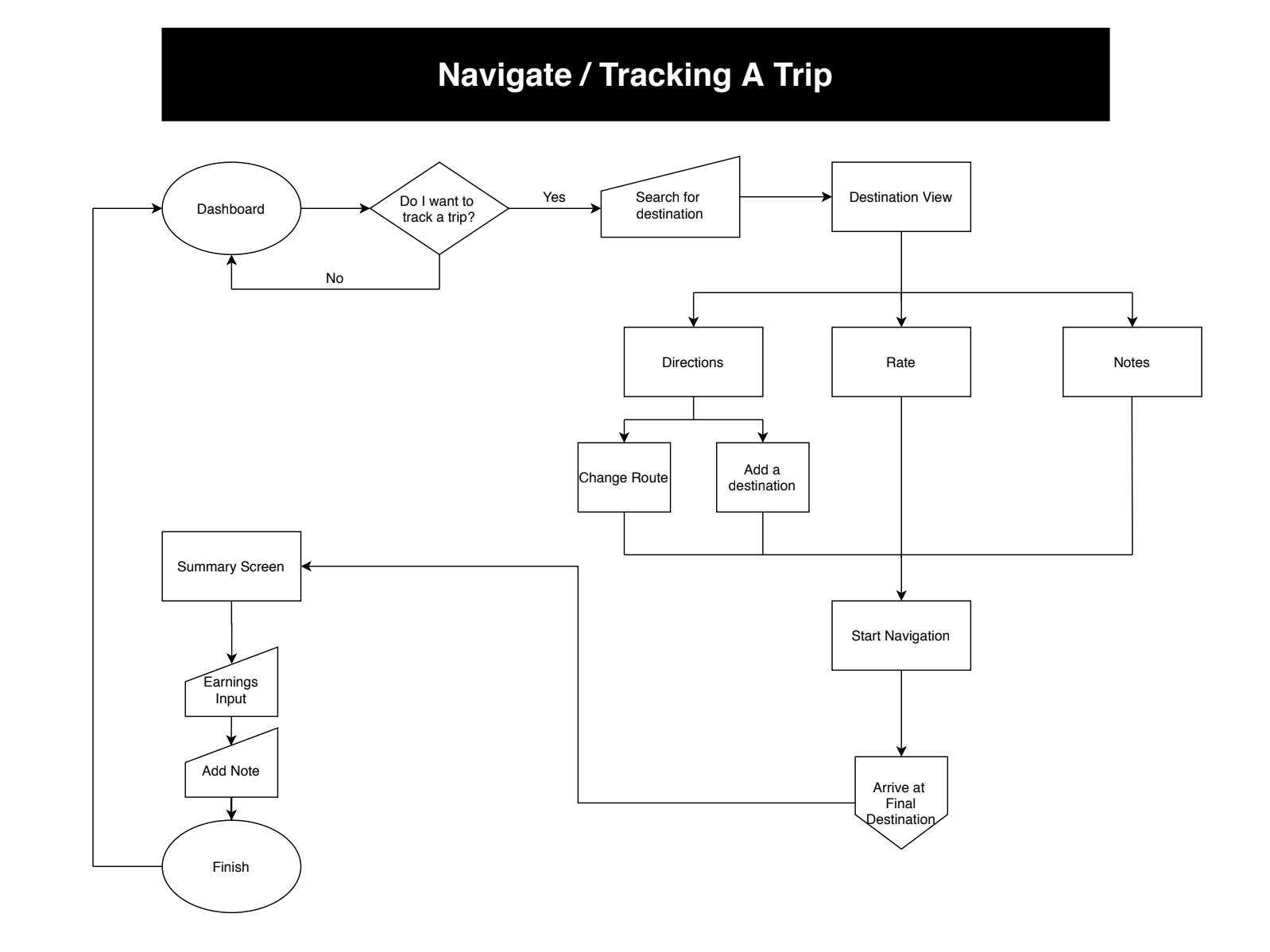
Tasks included in the MVP became mapped out in a flow chart. User flows were created to ensure that each process was as simple and stripped down as it could possibly be. The flows were designed to be simple so that a driver on the go would be able to easily perform the functions without eating up too much time along with being completed under the stress and pressure that comes with the job.
With user stories backed by research in place, and mapped out through user flows. It was time to put pencil to paper and figure out the organization of the page content.
Wireframes
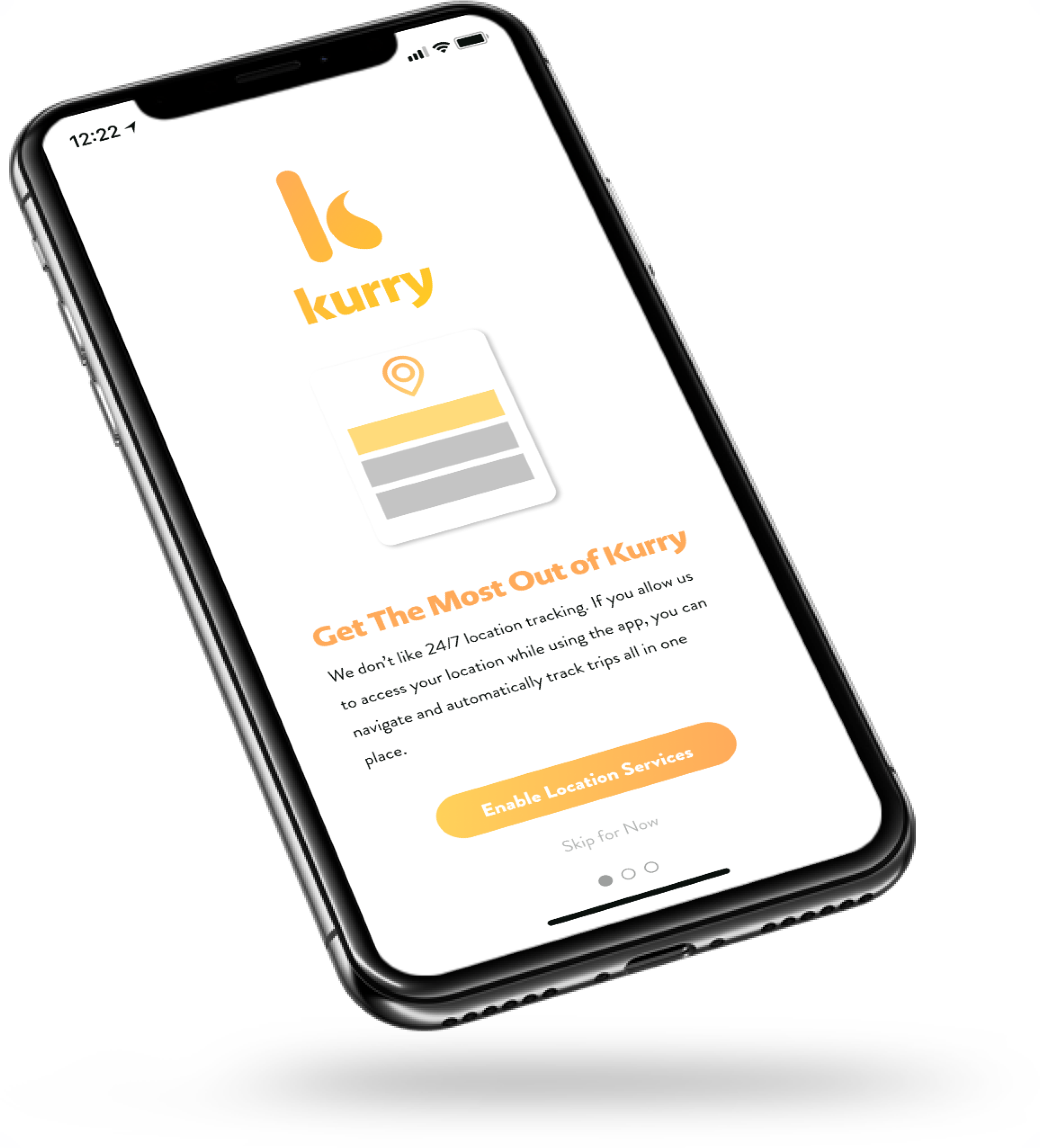
I knew onboarding would be a big part of this application so making sure the onboarding process was well communicated and seamless was very important in making sure drivers could comfortably use the application. By explaining the features on the landing page, users were able to see everything they could do in one spot.
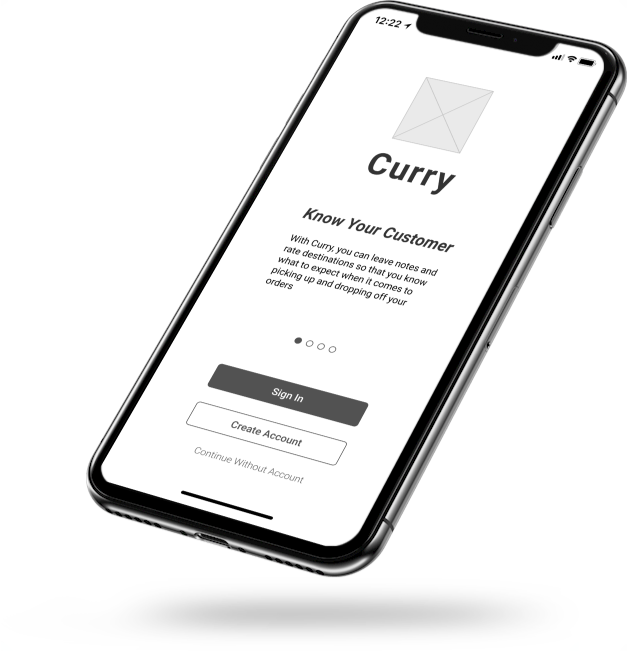
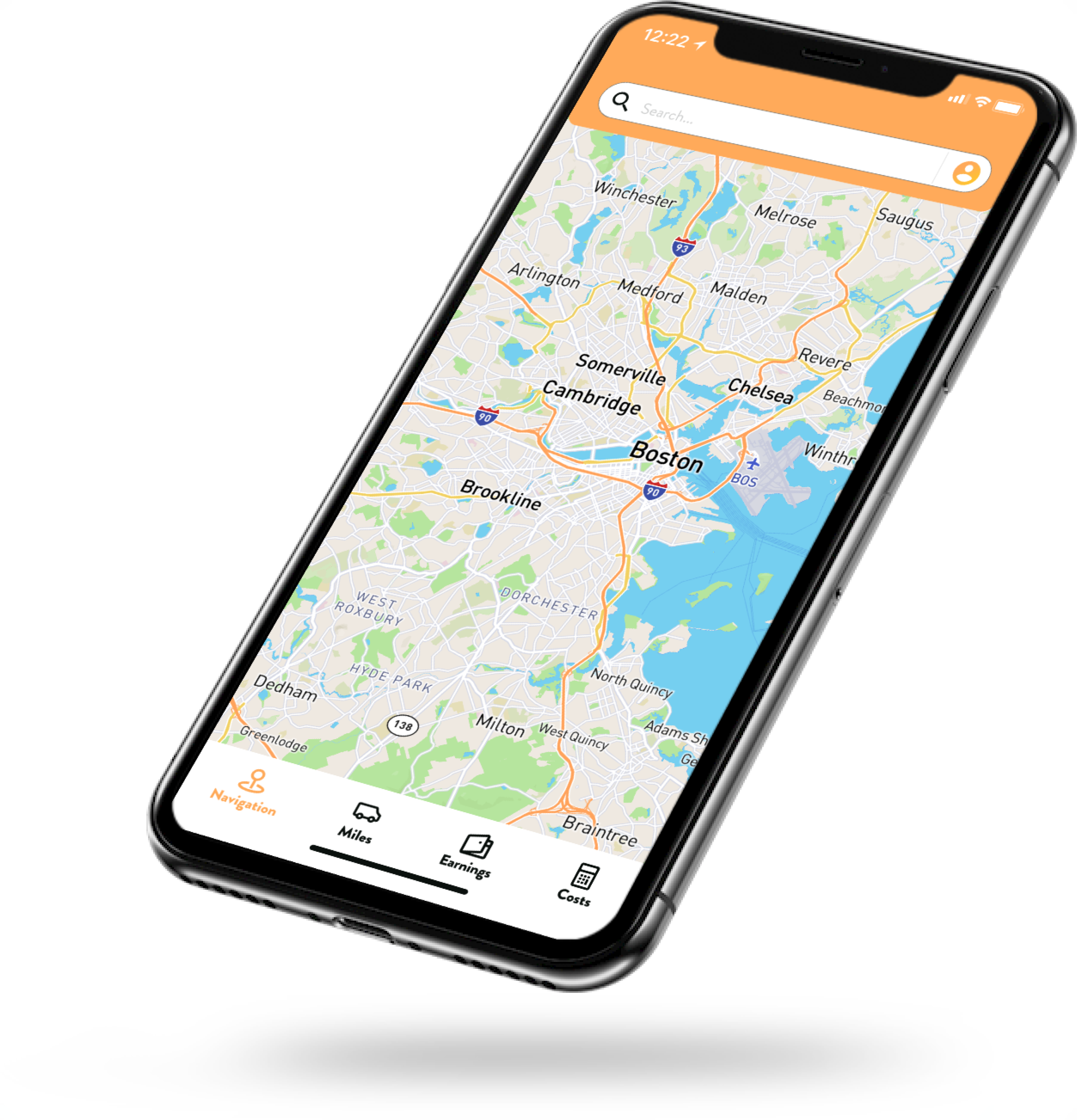
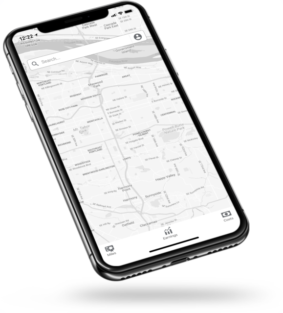
I created the dashboard to be a navigation page that you could route to and from destinations since that would be the primary feature the driver would use. Through this navigation you’d be able to track the information needed for tracking mileage and then at the end of the trip you’d be able to input the information needed for tracking earnings.
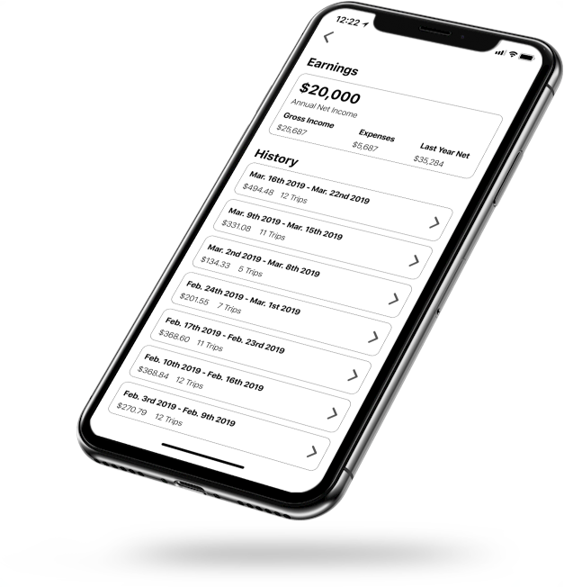
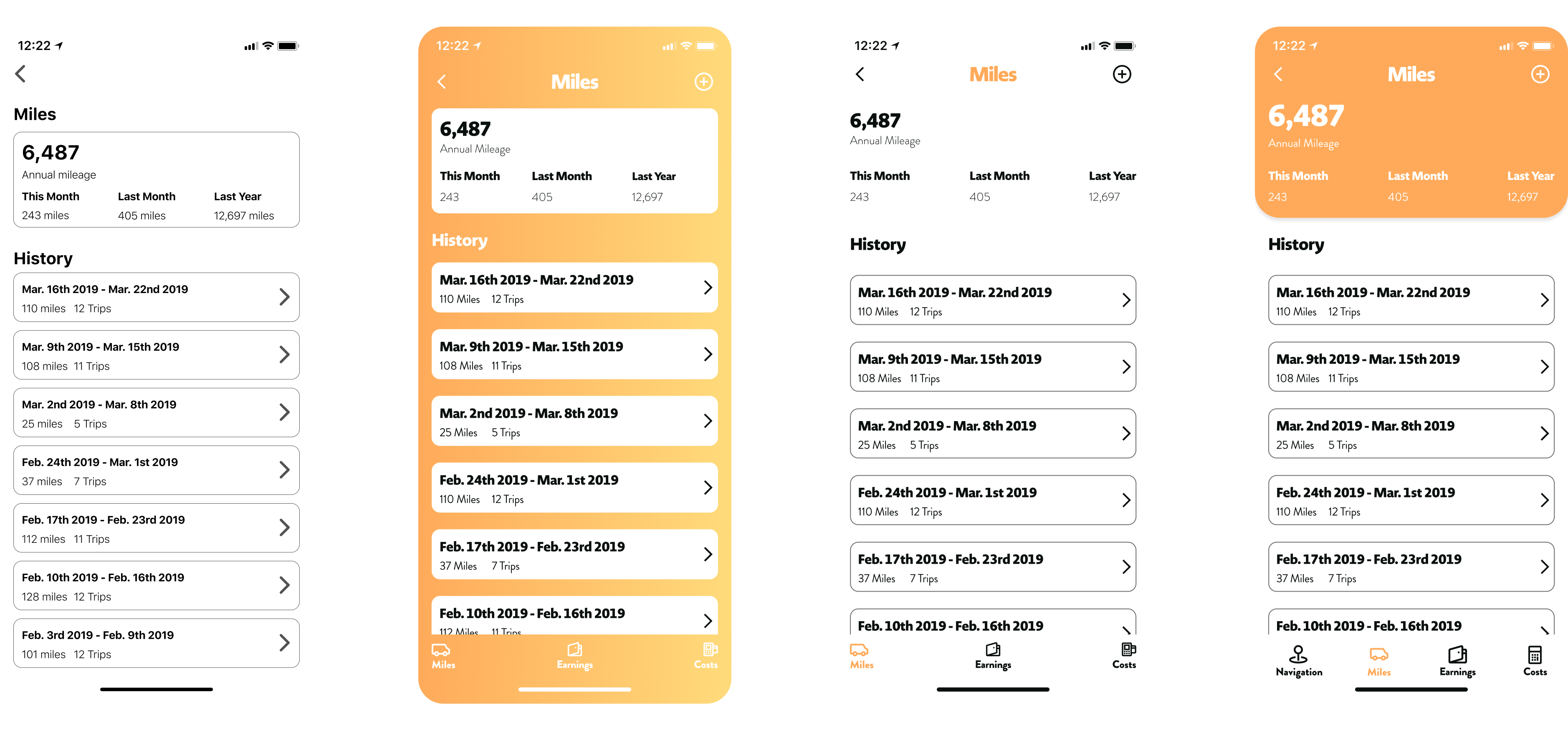
The earnings, mileage, and costs screens were designed to be easily skimmable and uniform. While each contains different information, the procedures on each page are the same to minimize the amount of procedures drivers would need to learn. At the top of the page you can see a summary for the current year, and then the trips are broken down by weeks below that.
On the summary page the intention was to be able to tap the fields and quickly edit the information (similar to how you wouldn’t have to hit a submit button on a notes application).
With a solid framework in place, it was time to do some branding exploration that could be applied to high-fidelity mock ups.
Visual Design
Branding
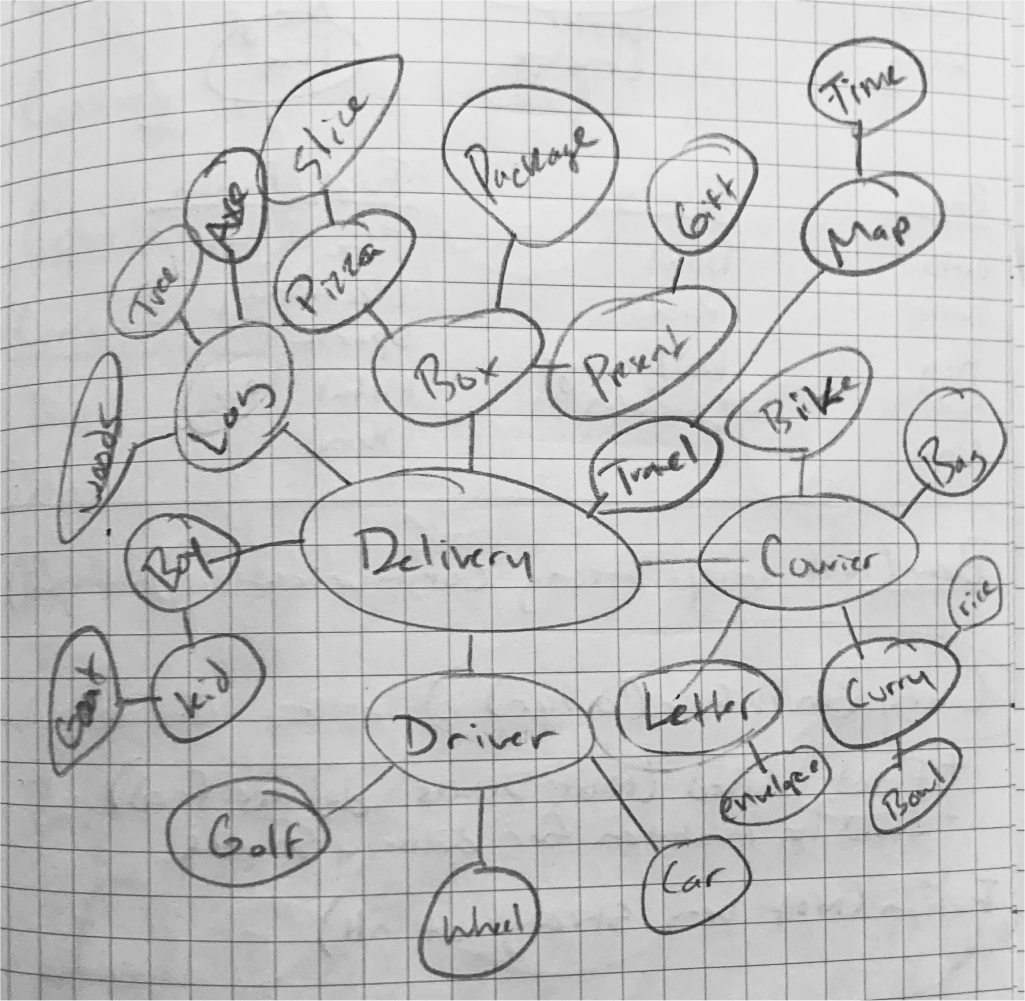
Kurry was named through a mind mapping exercise. While thinking about words that came to mind when thinking of delivery and courier drivers, curry came to mind. It worked well because curry is a food often delivered, and it was a nice play on words with courier. I ultimately decided to spell it with a “K” to help avoid confusion as to what the application does.
With the name picked, I assigned three characteristics to communicate through branding:
Warm
Energetic
Modern
Warm because heat is a bi-product of friction which is a result of movement. Which there's a lot of when on the go. Energetic because of the fast-paced nature of delivery driving. Modern because it's a platform for a modern gig. With the name and personality in place I moved to creating a logo.
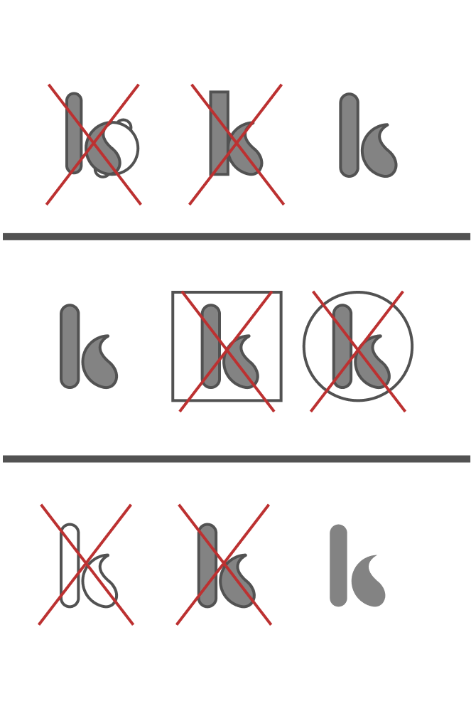
After a lot of sketches I chose a “k” logo as it was the most concise. After working through a lot of variations of it, I landed on this logo because of its simplicity, effectiveness, and usability.

To accompany the logo I chose the typeface “Novel Display” to use as the main type. I chose it because of it’s curved structure that accompanied the logo well. The secondary type I chose “Brandon Grotesque” This type accompanied “Novel Display” well due to its similarities in structure and variable weights.

Kurry Color Pallete
I chose a simple color palette that consists of an orange and yellow as it’s resemblant of the dish curry, and evokes feelings of action and movement.
Branding: Guidelines
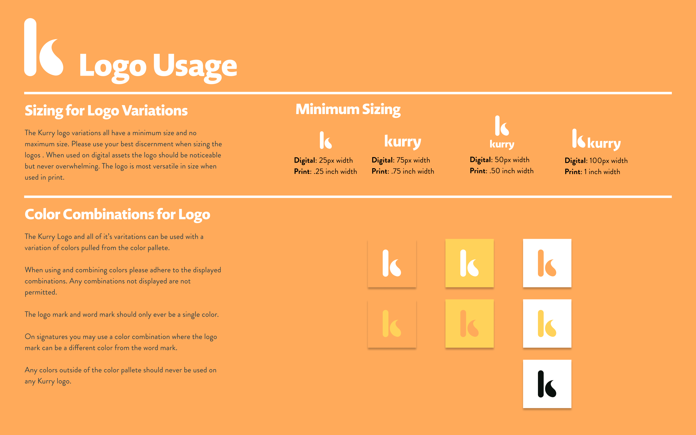
Guidelines were created to make sure the brand remains consistent across the board. The guide covered topics ranging from logo use to typography practices. It also includes button styles and acceptable color combinations.
With the brand guidelines in place, I created the first round of hi-fidelity mock-ups.
Mock-Ups (Rd. 1)
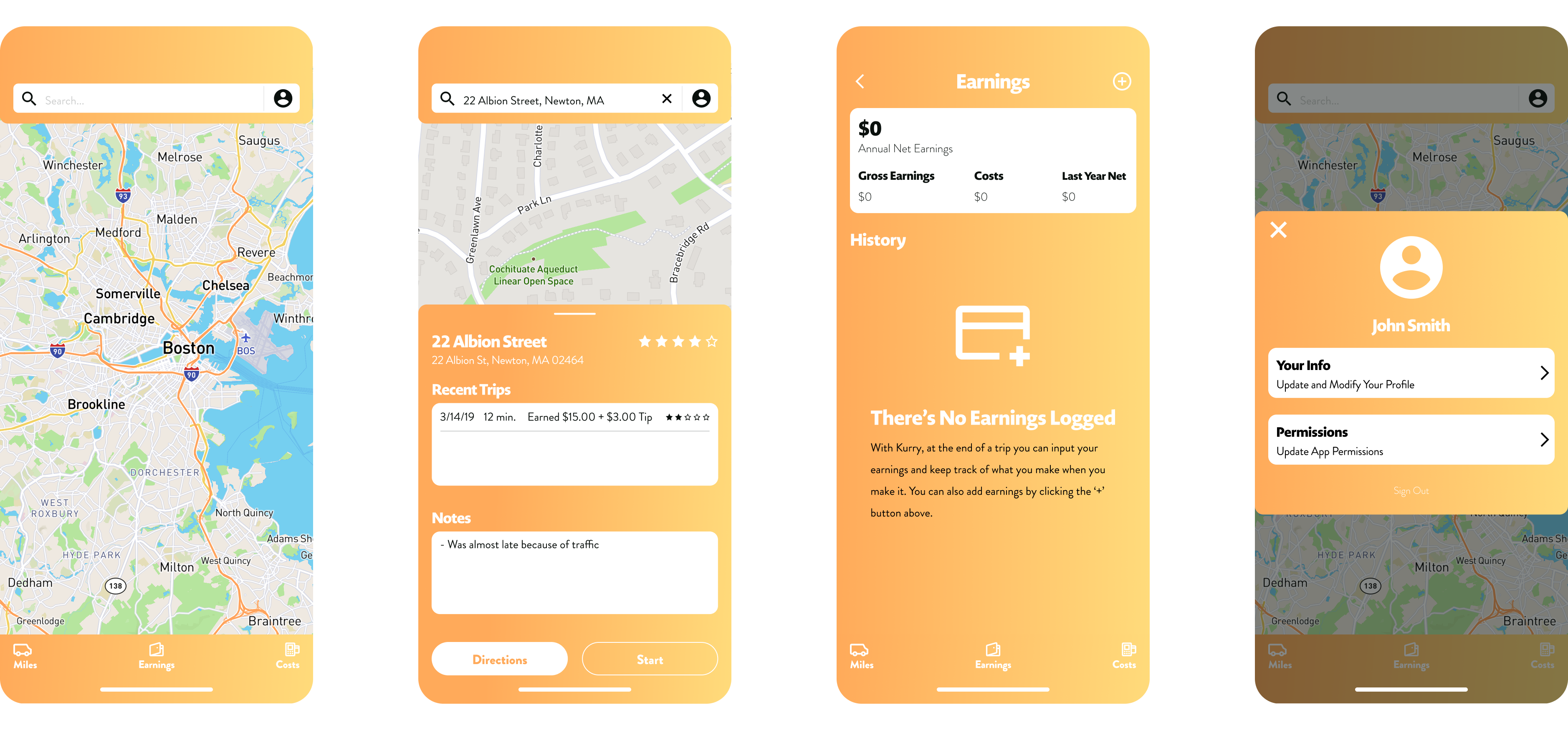
The first round of prototypes came with not too much change. Basically the wireframes with the branding color. I utilized a gradient to help bring the application to life. However...it was way too much gradient.
Mock-Ups (Rd. 2)
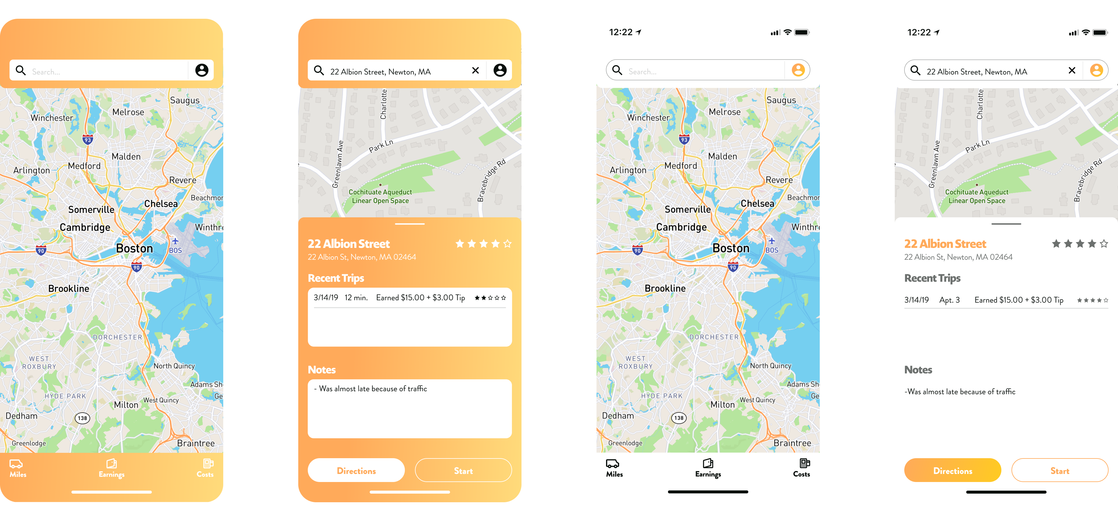
Due to accessibility concerns (as well as a sheer overwhelming) with the gradient, I chose to stick with a white background and utilize the color to direct the user to important information or elements.This change helped eliminate the need for different color cards to put text on, as well as helped clean up the whole aesthetic of the application. With this change it was much easier to digest the information.
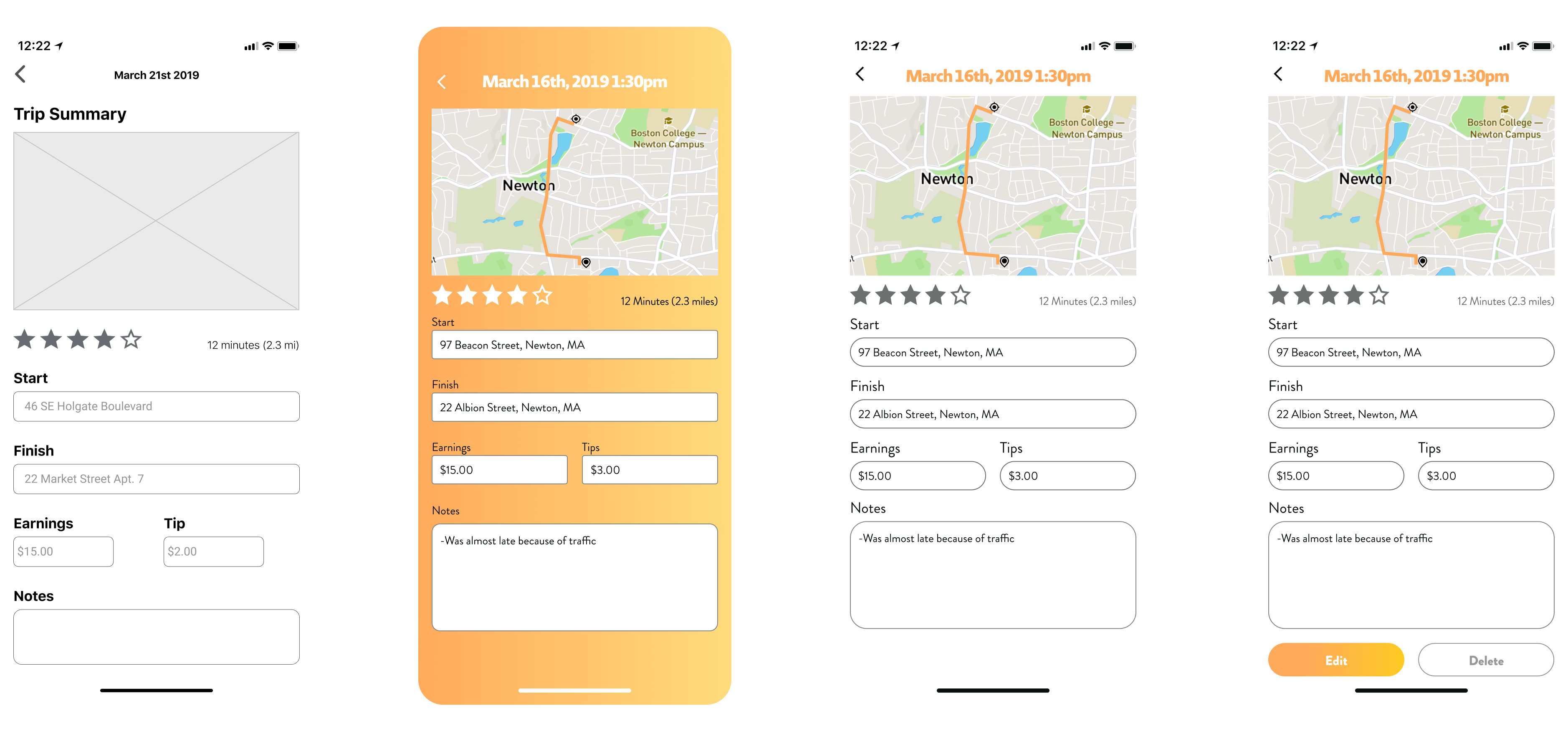
The only other major change that came about was adding edit and delete buttons on the summary pages. While the original intent was to keep it simple with fields. It was never completed successfully on the paper tests so it seemed the buttons were the best way to go.
I took these hi-fidelity mock-ups and created a prototype. After writing a testing script, I ran a few tests to see how the application was working.
Generally the tests were very successful. All of the test takers were able to complete the tasks, although not always in the intended route. Although generally successful, there were still a few changes to be made.
Finishing Touches
Tab Bar
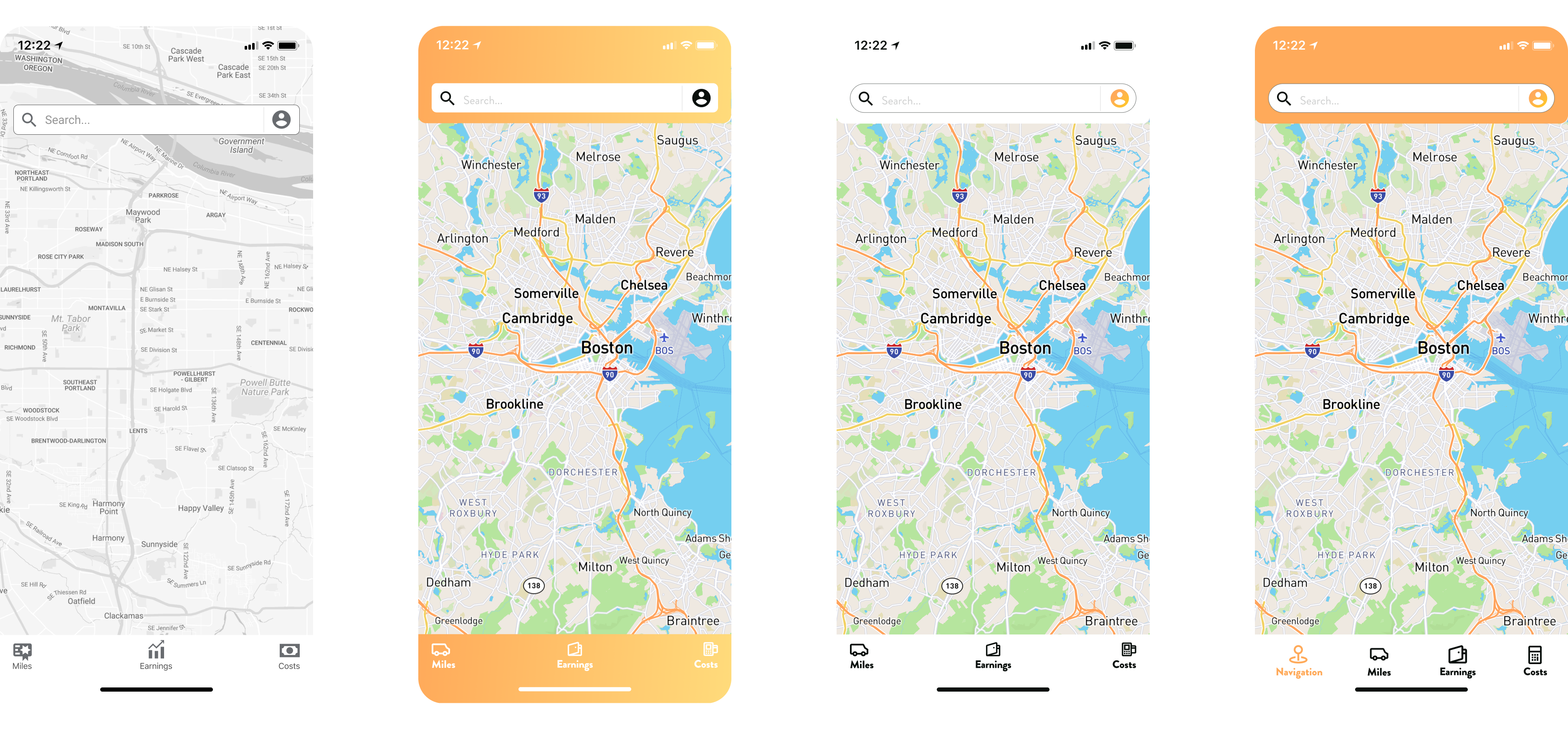
There were a few different approaches to this that I tried. The biggest two I contemplated were either keeping three tabs and having the icon change while on that page (For example if you were on the mileage page, the miles icon would change to a back arrow to bring you directly to the dashboard), or just adding a fourth tab and remove the name “dashboard” and just call it navigation. I ended up choosing to add the fourth tab and name it navigation because it seemed the least complicated, and switching an icon on a user felt like grounds for unnecessary confusion.
Added Some Color
During the test it came up several times that the application felt very white. To help with this I made some elements orange to help bring the application to life.
Quick Access Edit and Delete Buttons
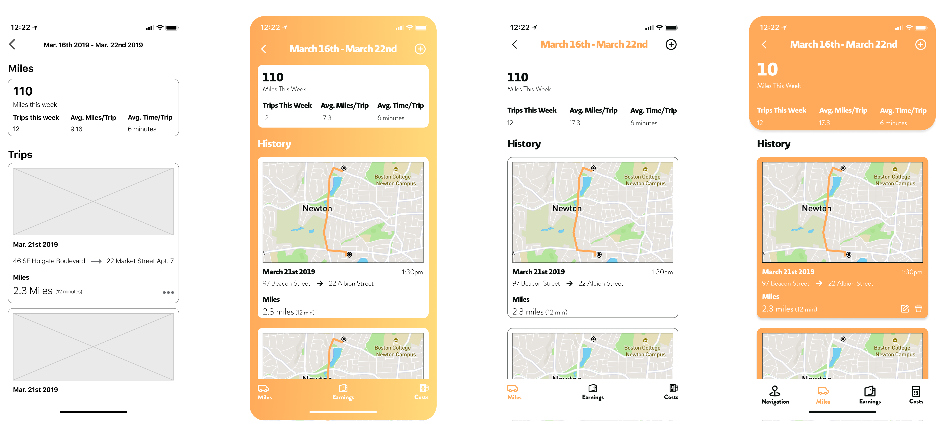
The final change was adding quick access to edit and delete buttons on the detail cards. It didn’t come up in testing but thinking through making this as accessible as possible for a driver on the go inspired the addition.
Final Thoughts

If I had to choose a recurring theme for this project, it would be that research is key. It started with the features of the project. While I thought the desired features would be about coordinating multiple trips, it turned out to be as simple as leaving notes on customers. Then the theme kept popping up whether it be with color use, button locations, or how features work. While it’s easy to just run with your original ideas, there’s so much more value in getting as much user testing in as possible.
If I had more time on this project, I think I would spend more time redesigning how information is stored and organized. Maybe just have a general trips section with cards that contained both mileage and earnings. Then a finance section that has information for costs and gross income. I would also do some more logo work as I wasn’t totally sold on the final one, however for sake of time needed to turn it in.
All in all it was fun to create a product that would help with my actual life. To see it come to life from idea to prototype was a gratifying experience.